by Heather T. | Jul 26, 2023 | Business, Marketing, Observations, Operations, Opinion
 We recently had a chance to take a little time off and rented a VRBO for our kids and grandkids to come and stay for a few things.
Sadly our local B&B that we would generally put them up at was booked up, so we had to settle for what we could find. Anyone who knows me knows I am not a fan of vacation rentals, this one at least had commercial liability insurance (a must to protect owners and guests) and was legally a business paying NH rooms and meals tax, so there was that.
This is not meant to be an op-ed on vacation rentals or to pick on them but to point out if you are a property owner of any kind renting short-term property out, legal B&B, hotel, motel, hopefully legally vacation rental…. You really should check out the rooms and property from the guest’s perspective. Further down in this post, I also touch on brick-and-mortar retail stores.
I’ve touched on this years ago in a couple of blog posts, Why it pays to sleep around for Bed and Breakfast owners and for restaurants, View Your restaurant from a customer’s perspective.
This property had a vacation rental manager who lived according to her, literally right down the road. The property was clean (except for the toaster oven, I’ll give that pass :), beds were comfortable, and it wasn’t out in the trees price-wise, all pluses.
But, In the main bathroom, the sink didn’t drain, and the whole fixture of the faucet was loose, so when you turned the water on, the whole fixture tilted.
In the kitchen, most of the knobs on the drawers and cabinets were loose, and I spent 5 minutes fixing them myself because it was bugging me. There were some other minor issues with the property (aside from the sink, which we did mention to the manager) that were not enough to be an issue or to complain about but it’s what sticks as a memory of the stay for my family. And the point is not to nitpick but to draw attention to the small details. Our kids and grandkids had a great stay otherwise but didn’t leave a review because of the small things.
There are mixed feelings from vacation rental hosts about supplying some essentials; some properties give guests starters or, depending on how long guests plan to stay, at least a few day’s supply of things like napkins, paper towels, and a garbage bag or two. Other rentals have a, “Well” we are not a hotel”; renters need to bring everything on their own.
I lurk on many lodging forums, both legal and not-so-legal lodging, and the discussions and different viewpoints are fascinating.
I’d point that that properties need to clarify that if they are not going to provide the bare minimum, state it explicitly up front. I’ve seen a score of rental sites saying, “Everything you need for a perfect getaway!“ (that kind of implies everything, no?) and then don’t have the little things. (as evinced by scores of reviews I’ve read)
While experienced vacation rental stayers may be hip and bring things, what about someone renting for the first time who may need to be made aware of having to bring everything? Or a case like this, where a renter might know but OOOPPPSS, forgot those paper towels, and the nearest convenience store is a good half-hour away. I’ve lost count of the number of reviews I’ve seen on vacation rental sites and other review sites where people are commenting on this. Apparently, not everyone pays attention to their reviews and they probably should. I wouldn’t be writing a blog post about it if it was just me observing this.
How much of an outlay is it for a place to have at least one roll of paper towels, a couple of extra garbage bags, and some napkins (just as examples). $3 isn’t going to detract much from that $400 a night a property is charging. Again this is not to nitpick, we were prepared and brought things, but how many people may not be or forgot something?
Here’s where I go back to if a property with no onsite owners wants to up their game, stay at the place, what’s wrong with it that’s fixable (even if it’s super minor)?
How can you make things just a bit better for guests? (and be legal, for heaven’s sake! Yep had to add that, darn my fondness for legal lodging).
It’s the little things that can make or break a stay for a guest and, even more importantly, lose a potential repeat customer and not have them leave a review, either positive or not. It IS the small stuff that tips people over the edge on leaving a good review. At a restaurant having an excellent meal with great service but the coffee at the end of the meal is cold is another great example.
What this is really tied into is this goes for ANY brick-and-mortar business out there.
When did you last walk through your retail shop/store selling clothing (as an example) and pretend you were a customer? Really “be” a customer, no joke.
Can those short people (I’m one of them, so this is an endless challenge shopping in many places) reach things?
Can the tall person with larger feet who is a customer reach down easily to get to the lowest row at floor level because not thinking about it, that’s where you have placed the larger shoes, and you did it for the convenience of yourself, not the customer?
I stopped into a little shop recently on a trip, and I had to ask the owner to take down some suit jackets I wanted to look at (note she was not overly tall but still had 6 inches on me). While in there, I also observed several other people (also vertically challenged) who felt some of the clothing, looked up at the clothing for more then a minute, and then walked away.
A question I’d be asking myself if I was the shopkeeper and was paying attention to my potential buying customers (this was the owner of the shop there, so no excuse that this was an employee) is how many of those people that had a little more than a passing interest in something too high to reach without having to ask, might have taken that shirt they were interested in and went to the mirror with it and then possibly to the changing room to try it on, to potentially the cash register and bought it??????????
Just because something is in person doesn’t change the sales funnel.
I’ve seen people pick up shopping baskets in stores, go to the back of a store (not necessarily a big box store) where there are large heavy objects, pick something up, put it back down, or pick it up, put it into their basket and then pick the basket up, put it back down and then place the item back on the shelf either because they wanted to do more shopping and/or they just didn’t want to lug it and anything else already bought up to the counter.
I’m not saying move all your heavy stuff up toward the cashiers but instead be more observant of your customers, not to mention if you’re the owner or manager; paying attention to customers is a good positive thing for customer interaction, but it also cuts down on theft.
In our local Supermarket, many of our stockers are on the tall side, and the general manager/purchaser doesn’t pay attention to things like double stacking, stacking above the cold line, or putting products into space where other SKUs belong, this includes allowing stock people to put items like gallon containers and #10 (extra large cans) on the very top shelf of aisles. For shorter people, we can’t even reach the top shelf half the time, let alone take something heavy down easily, and the reverse can be true if you have heavier items that frequently sell, putting them on the bottom shelf so taller people or older people have to bend down very far to retrieve them isn’t particularly helpful either.
Double stacking boxes on the top shelf makes it a challenge in Jenga to take a box down, no matter your height, and I’ve seen boxes of Cheerios falling on old ladies because they are double stacked, ouch ☹
Another common one is aisle space, sometimes you are at the mercy of a layout that you can’t change, but if you have racks, tables, or shelves that are movable, I challenge you as an owner or manager to dress in winter clothing with a bulky winter coat and/or bring a large bag/purse with you (or get a friend or employee to do it if you don’t feel comfortable with it) and aisle walk.
Can someone easily navigate through aisles? Do their clothes or bag catch on things or potentially brush things off a table or shelf to the floor by accident? What about people with strollers or carrying portable baby seats?
I’ve lost count of the number of times I’ve walked into a store and, within a minute, walked back out again because I’m afraid my bag (which isn’t huge), and nor am I, is going to knock something off a shelf because there is not enough space to walk easily without having to be hyper-aware of bumping into things.
I’ve also lost count of the times I’ve been behind someone going into a store who has done the same thing, walked in, and then turned right around and walked out; you’ve lost your sale before you even started.
One more is a public bathroom for shoppers. Does your stall have a hook on it to hang coats and bags? No one wants to put those on the floor, no matter how clean it looks. Not just women carry bags; what about bikers (motorized and non) with backpacks or fanny packs they may want to remove as an example, or coats for all genders?
Case in point, many box stores have a small ledge to put a purse down on. In traveling last week, I stopped at my favorite smokehouse in Bennington, Vermont (Henry’s Market); going to give them a shameless plug because, IMO, they have excellent sandwiches, great smoked meat, and friendly staff whenever I have stopped in every few months.
They have an ice cream cooler with a flattish top right in front of the cash register where you put the items you purchase. All five of the woman in line in front of me used the cooler to put their purse on to dig out their wallet, as did I, as did two of the men who were shopping who rode in on motorcycles and had backpacks. They may not have intentionally done this, placing the cooler there, but it sure made paying easier.
Sometimes it’s just a little thing to make a retail experience that much better, and it’s the small things (that detract) people remember.
It’s not just sales; it makes reviews telling (or not). How many reviews does your brick-and-mortar establishment have? You have a great product or products; things are priced well, and your customer service may be exceptional, but where are your loads of good reviews? If you’re not getting them and you’ve checked off all the former points, maybe it’s time to take a good look at your customer “experience” when they are in your establishment and be observant, put yourself in the customer’s shoes.
The phrase, Don’t Sweat the Small Stuff is the opposite of true when it comes to the customer experience. It’s the Small Stuff that matters and can put more money in your pocket as a business owner and I hope that matters.
by Heather T. | May 23, 2023 | Business, Marketing, Opinion
As I continue to go down the AI rabbit hole, I keep seeing suggestions out there for using AI to generate social media content, but I haven’t seen a lot so far giving actual specific examples and testing the existing platforms against each other. I’m sure they’re out there since I started playing with this, but I wanted to give you my personal take and some comments about what I found so far.
I love free stuff, especially for free platforms. While there are a lot of paid options out there, I wanted to try to stick with the free ones just because I work with so many small businesses with very limited marketing budgets, and the last thing I want to do is start suggesting paid platforms when there are just as many good alternatives out there that are free.
There was recently an article on Make Use Of on using Canva to bulk generate images so I gave it a try. This has some pros and cons, for example, if you’re doing quotes if your not really specific about the prompt given. When you ask the AI generator to do quotes, you need to give it some very specific parameters about how to separate the data; otherwise, when you copy and paste it into a spreadsheet, you still have to spend some time separating the text into separate columns.
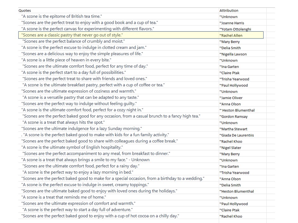
I found when I first started playing with this option, I asked it to generate quotes about scones, and I didn’t give it specific parameters and then had to spend about 5 minutes separating the columns out from each other, which realistically from a time perspective isn’t a lot but if you were doing a whole lot of these that time can add up, and it doesn’t necessarily become a time saver.
So here are some examples, just as a test of some scone quotes in an Excel sheet uploaded to Canva and then autogenerated into a very basic template for scone social media posts. You can do a lot more with it, and I came out with some more creative things after messing with it for a bit, but again you have to think about the time you’re spending to create the templates first. And then the time to customize them a little bit more so they’re not all identical.
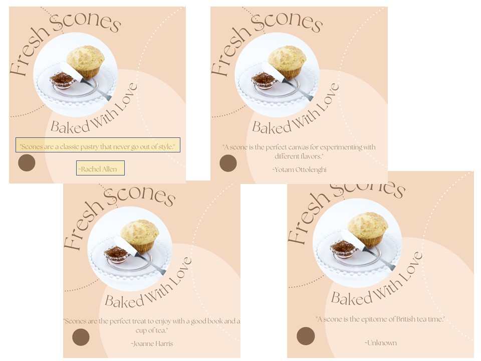
Is this all worth it? I can’t say for sure it is, and I can’t say it’s not. That is only something you need to figure out if that will save you time and what kind of image your business is projecting.
The other questions I had were what else can you use it for? I had seen some suggestions for generating post content, for talking about email content and email subject lines, so I was curious to see what some of the various free AI platforms would generate when prompted when compared with the same prompts side by side.
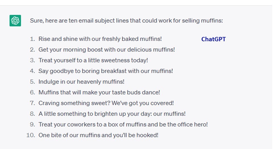
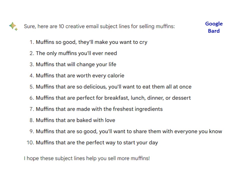
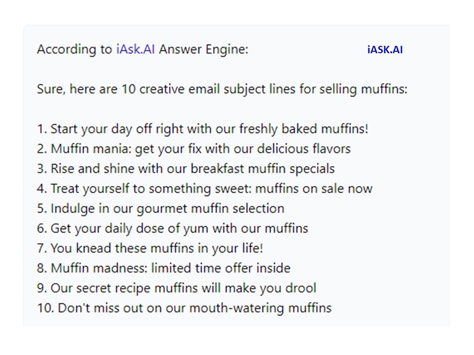
So the first question I asked and ran through some of the AI platforms was “Write 10 creative email subject lines for selling Muffins“. Now, of the results I came out with from Chat GPT, Google Bard, IASK.AI, and Bing’s AI I found some interesting things.
ChatGPT, for example, spit out some interesting content, but realistically, of the ones that really popped visually/text wise and I think I would put in the category of good open lines (meaning it would entice someone to actually open an email if it landed in their email box) I would say maybe only three of the platforms did well in terms of coming up with decent quality examples.
Google Bard, I think came up with only one or two of them from a consumer’s perspective that would want to make me open an email based purely on the subject line.
IASK.AI spit out pretty much the same thing as Google Bard, none of them were terrible, and a couple of were pretty catchy, but again, based on a consumer opening an email based on the subject line, there’s not enough of a catch in them IMO.
Bing’s AI, I think was the winner of this particular trial. Of course, this is a personal perspective, and I thought it was interesting that they were also putting emojis in the subject line, which can work depending on your target market and your age group. Of all of the content that the AI engines spit out, these had the most of what I will call “carrot opens”, which means if I read this email subject line, there was enough of an incentive in the subject line for me to possibly want to open it.
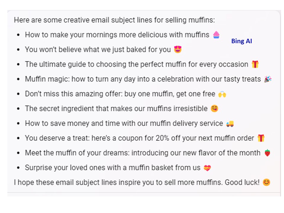
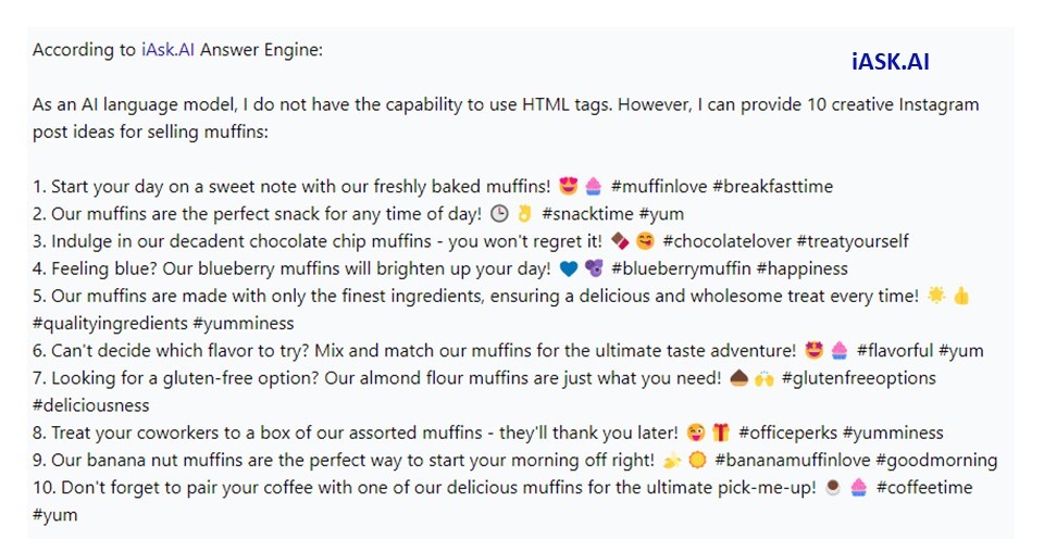
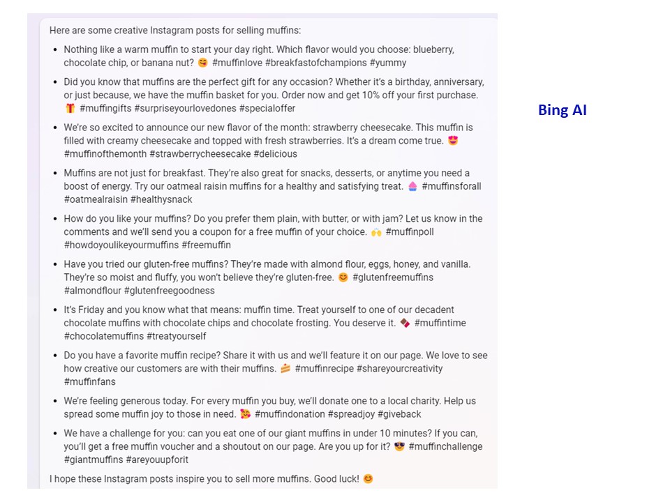
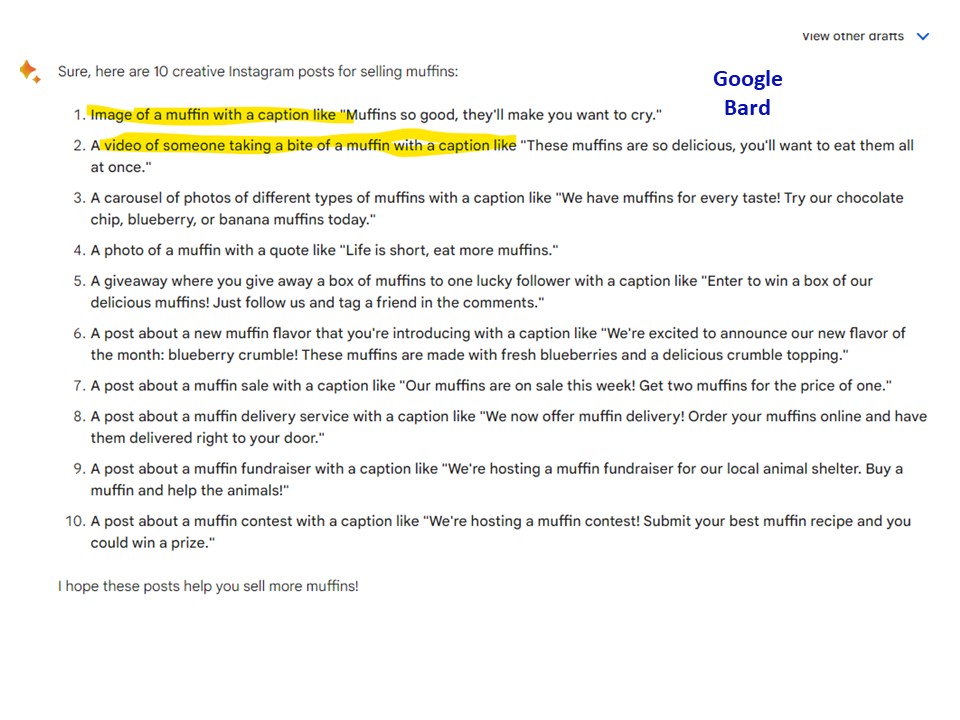
The next test that I gave some of the AI engines was, “Write 10 creative Instagram posts for selling Muffins”.
Now what I thought was really interesting here was that some of the platforms autogenerated some hashtags, but not nearly enough for Instagram, and a couple added emojis.
What I found the most intriguing about this, though, was there was a big difference between the fact that some of the AI platforms recognized the fact that Instagram also needed a photo attached to it or an image, and it was not just text-based or others did not.
IASK.AI for example gave some emojis, and they gave some hashtags but no photo prompts. Bing’s AI did the same.
Google Bard gave image prompts with short Instagram posts, but they did not give hashtags, and did not include emojis. The emojis were not necessary, but I do think it’s interesting that they did not include hashtags at all.
ChatGPT also gave text for a Instagram post, emojis, some hashtags but no image prompts. (and emojis were before the text compared to some of other platforms).
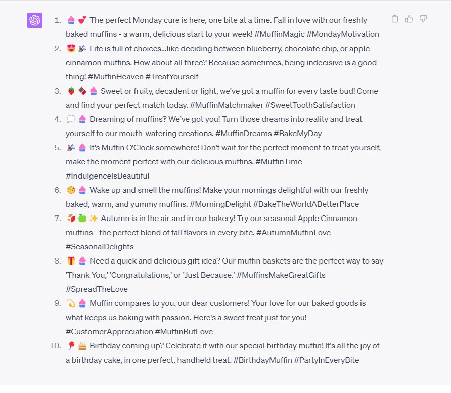
The last prompt that I gave the AI platforms, at least for the time being, as I continue to mess with the options and with new AI platforms as they come out is “Write 10 creative scripts for Youtube shorts for selling muffins“.
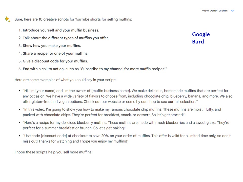
Now a YouTube short is under one minute long, and keep in mind like Instagram, it also needs the visuals, so I was curious to see whether the AI engines would actually give visual prompts, not just scripts.
In Google Bard they gave some suggestions about what you could do with the YouTube shorts and gave some sample scripts but no visual prompts.
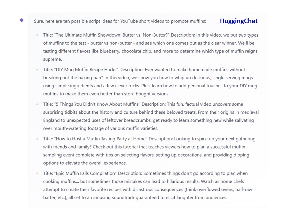
I decided to add one of the others I had been testing out that had not prior given decent results in other prompts. Interestingly this one gave some interesting results for this particular test. In Hugging Chat, they gave some script ideas, and they gave titles, and they gave some audio prompts, but they also didn’t give visual prompts.
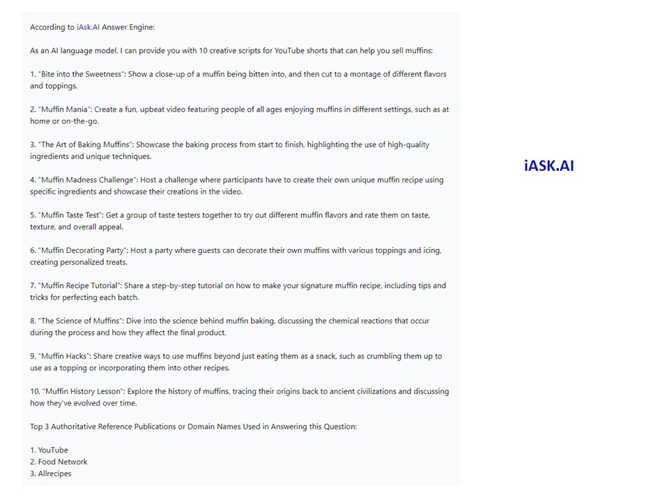
IASK.AI also gave some interesting results, but it was kind of a mishmash. It gave you some titles like Bite into the Sweetness and Muffin Mania, and then it gave you some visual prompts, but it didn’t give you scripts.
ChatGPT gave off some possible titles of YouTube shorts and gave some visual prompt suggestions, but again no scripts.
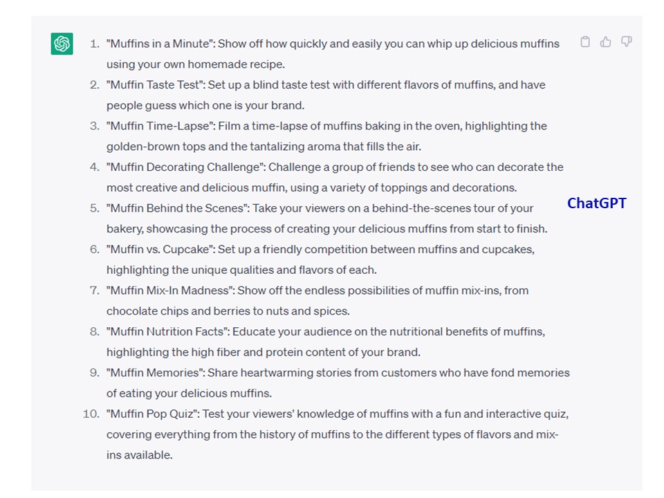
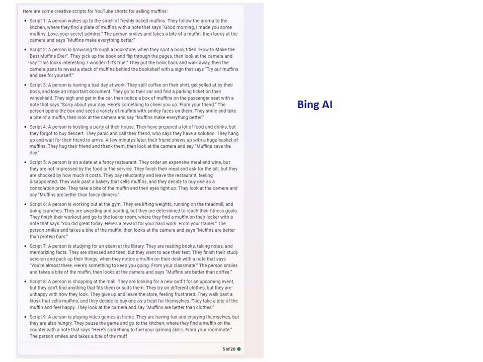
Bing’s AI was again almost the winner in this particular prompt in that it gave you an actual script and it gave you a visual prompt. No titles though.
What I deduce from this test, and I know that this is a work in progress as AI platforms gather more data and become more evolved, is that no one platform is going to necessarily spit out everything that you need.
I was interested from a testing perspective to also see how much AI platforms so far have built-in information, like what is needed for particular social platforms. Instagram for example, HAS to have some sort of image, and the text, hashtags, and emojis are kind of useless without one, or not very helpful from a marketing perspective without an idea of what to use “as” an image.
If you take and use the prompts and the ideas from two or three of these platforms simultaneously when you’re running into roadblocks coming up with ideas and creating content, it can certainly generate enough information and ideas.
From a time-saving perspective, I think it can definitly save time and some hair-pulling to come up with new/creative content because it helps you get your brain and your gears working when running into the “Oh Jeez, what do I post next?” which seems to happen to most businesses, sometimes sooner rather than later.
All of the prompts used were simple prompts and while you can get a lot more specific in terms of the ask and what you want generated, I wanted to do this in the context of the average business owner who would not be asking very specific prompts or even know to do that or what to ask in detail.
Curiously on all of the hashtag suggestions there didn’t seem to be any parameters (or data) on whether the hashtag had decent usage at all on a platform, or even if it was used at all. In the case of #MuffinMatchmaker suggested by ChatGPT, not a single hashtag use on Instagram. #MuffinTime on Instagram had 174,103 results, Facebook it had 40K posts and Youtube not a heck of alot unless you count suicidal muffin songs, and that one is not even using the hashtag.
So if your going to use the AI platforms suggestions for Hashtags on any platform, I’d suggest doing some research first on market saturation of the hashtags first and check them for each platform in terms of numbers and marketing weight before you just blindly take them at face value.
My next rabbit hole is to ask AIs to evaluate hashtags and how they are rating and evaluating them (if they even are, and I don’t think so -Yet…..). Google Bard for example suggested some ones for Facebook (in a seperate test) that had less than a thousand posts attached to it, so it looks like they have some work to do, and the majority of the suggestions it spit out for Linkedin as another example, had a big ZERO in terms of usage on the number of posts. Hmmmmm………
by Heather T. | Apr 12, 2023 | Blog, Business Networking, Marketing, Opinion
 In some ways, I’m a bit of a Luddite; I still dislike my cell phone (I had a Tracfone for years until I was dragged literally kicking and screaming into the 21st century a few years ago). I still use a paper calendar for scheduling my week (this is more that my brain can’t process things in a digital format for scheduling and try to find room to breathe occasionally. I like being able to visually lay out my week and schedule meetings and workshops where I can find time to do work in between them). But I digress.
My friends and many business associates chuckle at me because in most ways, I am a massive computer and technology geek. AI fascinates me, for example, down a rabbit hole I go. Ohhhh, new social platform alternative to Twitter…………Ohhh, Canva Design challenge……
But……. Printed physical business cards vs. digital. I suspect until we do away with paper entirely and also in-person meetings completely, physical business cards will be a long time in going away.
In the past few months, I’ve had several interactions with people who did not have physical business cards with them. All three went overboard trying to convince me that they no longer needed physical cards any more or even business cards at all. I’m afraid I have to disagree.
Let’s explore those interactions for a moment.
The first was back in January, where I got into a discussion with the person online in front of me in the grocery store when he commented on my custom business imprinted grocery totes. (it was a long line, not enough cashiers on duty). He asked me about my company, and we chatted for a few minutes, and I gave him my card and asked him for his.
He said, “I don’t carry cards anymore because I use digital cards now, I just converted to all digital last week. I think digital business cards are fantastic, etc. etc. the greatest thing since sliced bread.”
Well…. Ok then. I’m game.
Him: “Here scan this QR code on my phone.”
I scan the code. Me: “Ok, so is this what’s supposed to happen? It’s bringing me to the App Store on my iPhone to download a contact App.”
Him: “Oh, they told me it was supposed to get instantly added to someone’s contacts” (My ask was apparently the first test of the digital card).
Me: “I’m sorry the line is moving along, and I don’t really want to add one more app on my to phone if it’s just for one contact. Let me grab a pen, and I’ll jot down your email/phone number.” Good thing I had a pen……
The second was at a home show in Manchester, NH, my husband and I went to last month and got pigeonholed by a guy at a booth selling garage flooring. It was kind of interesting so we stuck around to chat. The booth was completely paperless.
When I asked for a card, the fellow said, “I don’t do business cards anymore or anything in print, but let me have all your contact information so I can put it into the computer and follow up.”
Sorry mate, if I’m interested, I’ll call you. Not the other way around.
My husband caved and gave him his contact info with the caveat; don’t call me during the day; I can’t take personal calls when I’m working.
Guess when he called?
He didn’t even have a QR code on anything in or on the booth either (or on his phone) or even anywhere where his website was listed on the display so I could take a picture of it, so we walked away with nothing in hand to remember the company by, except for him having my husband’s information which didn’t work out so well for him. Several marketing fails on that one.
Unfortunately (or maybe fortunately?), I don’t recall the name of the company because again, I didn’t have a way to do so easily. And the fellow was very VERY adamant that this was “the Way!” Anyone else watching the Mandalorian? While I suppose I could have snapped a picture of the display with the business name on it, at that point I was a tad aggrevated at both the pushiness to get contact information and the “new tech is the only way to go.” He lost a potentially significant sale because of this (and calling during the time when told not to call didn’t help).
The third interaction was last week at a business event. I asked a new contact for a business card and gave them mine. “I don’t have print cards anymore” was the response I got. Ok. So I scanned the code on his phone into mine, and he is now in my contact list.
Well, just dandy folks, I met 15+ people after I talked to him within a short span of time. I got business cards from pretty much all of those people except for people that forgot them or they were out of them. Note, I also have over a thousand contacts in my contact list.
If I had a little more time in between meeting other people, I would “maybe” have had a moment to try to find the contact and add a note in about who he was and where I met him, but I didn’t get a chance. And I didn’t remember until days later, and by then, I forgot his name.
This is something to keep in mind for how people do in-person networking, you meet, you greet, you chat, you move on to someone else. So normally (and in this case), I probably would forget to follow up with him unless it was a super important contact and it was top of mind.
All of the business cards I received at that event, I’ve either connected with via email or on Linkedin if I was interested. And to whoever it was that I met and got your digital contact info, I’m sorry I don’t remember your name, and I don’t have time (or the inclination) to spend lots of time trying to find you in my contact list, so I hope YOU follow up if you want to connect.
I’m not poo pooing digital business cards, but I’d like people to consider the benefits of using and having BOTH digital and physical cards. I no longer have a Rolodex, but I do like the physical business cards, so I can make notes on them, track where I got them from (date and event), and then scan them in (and then they are digital). I also keep important ones in addition in the paper format as I may refer other people to them as they are easily accesible in a card file vs searching online for information, and I also may pass them along to other contacts.
To reference the last interaction, this is where having both digital and paper cards come in handy. “I got business cards from pretty much all of those people except for people that forgot them or they were out of them.” Have the digital format for people that want it (and as a last resort if you run out (can I just say tsk tsk though?) and use the paper for most.
I know I’m not alone, I do know many people who still keep Rolodexs or similar means of keeping cards, and until all of us old fogies and luddites die out, we might be customers, guests, vendors, or, if nothing else, good contacts. (Sorry, not sorry, if that sounds sarcastic but it’s true.) Until Gen Z completely dominates the workforce, which is coming, but still a decade+ down the round, business people have to remember that customers and business contacts still come in a variety of ages and technology comfort levels.
The other small (or large) thing to remember is if the contact application is in the cloud, is there decent cell service (or service at all in some cases) everywhere? In rural”ish” NH, there is still a ton of dead zones. So if your business card app is cloud-based and you can’t connect, how useful is it to you or the person you are trying to exchange contact information with? It’s just like QR codes (which I love, by the way, as a marketing tool), but if you’re in a subway, (the longer version is well worth the watch as well), as my one of favorite marketing peeps points out from a rather older video now, but still relevant, you don’t have a cell signal………
Also, what happens if your cell phone runs out of juice at that all-day conference you are at…..
(As a side note, mostly because I am so easily amused, Canva’s AI doesn’t seem to know what a Rolodex is, the right hand photos are AI generated in the photo collage at the top, if the odd shaped fingers hadn’t tipped you off already).
by Heather T. | Mar 22, 2023 | Blog
 Since AI first started hitting the news, I’ve been completely fascinated. I was expelled from the womb as a science fiction nerd, and my earliest memories of reading anything besides Nancy Drew stories were reading Isaac Asimov and Frank Herbert (who wrote the Dune series).
I was an early 70s baby. My Grandparents mostly raised me. My grandmother (also a sci-fi fan) shared her old Amazing Stories Magazine and Analog Science Fiction and Fact Magazines from the 20s and 30s. She had boxes of them she had saved, and I happily feed my psyche on those and her set of pretty much every book Edgar Rice Burroughs ever wrote. And for those who identify Burroughs with just Tarzan, 3/4s of his works were sci-fi, including a few of the Tarzan novels. As I got older, I still loved the books by Burroughs but despised the author for his beliefs. (But that’s a topic for another time).
I have many happy memories of growing up talking about science and science fiction with her. Not all of you may recognize these shows, so I encourage you to look them up for a laugh for a couple of them. I grew up on shows like the Gong Show, The Odd Couple, Nova (I loved Carl Sagan’s voice and listening to him talk about space, time travel and science fiction, and science fact), and of course, Star Trek reruns, I think that accounts for a lot of my rather wonky personality at times. And, of course, as a kid, I watched the cartoon the Jetsons.
It puts into perspective those old stories written 50 years before I read them in the 1970s; so much of what was pure fiction that authors wrote about that they didn’t see happening for centuries has happened within the last few decades.
Look how much has changed in the last 50 years; the cartoon, the Jetsons in 1962, had a meal replicator, we now have 3D food printing, and Elroy Jetson had a smartwatch, and he could watch TV on his wristwatch. How cool was that, then? How cool is that now?
Star Trek came out in 1966. Star Trek had the first mobile phones. In the show, known as the handheld communicator, aka a cell phone.
But that doesn’t hold a candle to AI. But it’s tied to it. Artificial intelligence is generally tied to computers but also robots.
Not everyone is a Sci-fi fan, but I’m going to throw out a bunch of examples of AI in TV and the movies, and most of you will probably have heard of at least one.
Examples of good artificial intelligence:
Johnny 5, Short Circuit
The Iron Giant
C-3PO, Star Wars
The Robot, Lost in Space
Vision, The Avengers
Lt. Data, Star Trek
Bad or evil artificial intelligence:
HAL 9000, 2001: A Space Odyssey
T-800, The Terminator
The Sentinels, The Matrix
The Gunslinger, West World
Ultron, The Avengers
The Borg, Star Trek
Wait, I said Evil. Can Artificial Intelligence be evil? Good question.
Was the original terminator evil? Well, it wasn’t an AI directly, Skynet was sentient, so that one is debatable. Skynet started a war because it didn’t want to be deactivated. Technically, if it were a human being, it would be the equivalent of not wanting to be killed.
In many cases, the “bad/evil” AI’s motivations were that it didn’t want to be killed/deactivated. From a human perspective, it’s understandable.
And then you take cases of movies like Lawnmower Man’s Jobe or Virtuosity’s SID 6.7, which puts a bit of spin on things. Jobe starts as a human and then basically merges with the machine. Is that AI? It’s an intelligent machine, so technically yes, but technically no, because it started as a human that went bad.
In Virtuosity, SID 6.7 is a digital blend of some of the worst killers out there in digital format that ends up as an actual real-world villain that goes on a killing spree. Sid is also threatened with being shut down. Is this a real AI with true sentience? Fear of being killed as a motivation, or is it a program based on some terrible people which acts out its base programming when given the opportunity? Why does it exhibit rage or glee if it’s just a program? That one never quite gets answered.
Can an AI be good or bad? Also, a good question!
We don’t know. That can be a philosophical, religious, scientific debate, or all three.
In many examples of “evil” AI, it’s a computer deciding the world would be a better place without humans. Well, are they wrong?
And this is not an argument about whether human beings should be around; it’s a rhetorical question meant to make you think.
I want to explore this for a moment and tell you what I think are three things that make people fear Artificial Intelligence and that are stimulating our flight or fight responses.
First, AI currently is not sentient, meaning it “thinks” based on the input it’s given. It can problem solve, but it’s based on the data it has access to. I think people fear this regardless of whether it can pass the Turing test or not. Like news highlighting Bing’s AI, which according to some journalists, has a mind of its own. Many people think AI means it actually “is” intelligent and free thinks.
The Turing test, originally called the imitation game by Alan Turing in 1950, is a test of a machine’s ability to exhibit intelligent behavior equivalent to, or indistinguishable from, that of a human. That doesn’t necessarily mean it’s intelligent and has self-awareness. It just means it’s enough to convince most people. And that’s pretty scary. It’s enough to be disturbing and make people uneasy.
Humans do away with each other, we do away with other species, and we damage the planet we live on. If a AI, regardless of whether it was self-aware or not, evaluated whether we are good for the planet or not, what do you think it would decide? And so we are afraid. It makes me afraid as well.
The second fear is we also run into something called the uncanny valley. We see it on tv shows and movies when a robot looks human, like Arnold Schwarzenegger in the Terminator, Arnie plus a ton of makeup to make him look a little “fake”. We see it in recent films like a recent horror movie called M3GAN, about a murderous child robot. In those cases and in most movies where it’s a AI robot on TV or in the movies, it’s also really a person “playing” a robot, which is disturbing enough by itself.
But we actually do see the uncanny valley in CGI in movies where things don’t “quite” look right all the time or in hyper-realistic video games. The news doesn’t help when they spotlight Boston Dynamics Robot Dogs Dancing or interview Sophia from Hanson Robotics on TV or news on the net.
The uncanny valley is an unsettling feeling people experience when robots and audio and/or visual simulations closely resemble humans (or, in the cases of the robot dogs, actual animals) in many respects but are not quite convincingly realistic, but it’s enough to make you feel uncomfortable and raise your hackles.
You may have heard of the news about deep fakes, where a person is basically digitally cloned by AI and other software, and the concern is that news will become even more questionable than it is now because you won’t know what is genuine and what is fake.
Our popular media hasn’t been helping pushing movies and shows highlighting the scare factor. The FTC recently came out with an alert about AI helping clone people’s voices based on finding public videos that out there and scamming people. That is super scary in itself.
The third fear is that AI will supplant people’s jobs, and I want to explore the pros and cons of what AI can do for businesses and the pros and cons of doing it as I see the potential it gives us. As stated in the title, this was part one; stay tuned for part two in my next blog post, where I’ll talk about AI for business, what it can do, what can’t it do and whether we should be scared of it or embrace it.
And in terms of AI taking over the world. AI, according the Oxford Dictionary, states:
Noun: artificial intelligence; noun: AI
The theory and development of computer systems able to perform tasks that normally require human intelligence, such as visual perception, speech recognition, decision-making, and translation between languages.
Key in on “perform tasks that normally require human intelligence” AI does NOT mean it’s actually intelligent and self-aware and is going to take over the world and do away with humanity. That “may” come down the road, but it’s not here “yet”. But we still fear the unknown and again popular media doesn’t help when they feed the fire of our fears.
by Heather T. | Jan 3, 2023 | Blog, Opinion, Toastmasters
 This was a Toastmasters speech I recently gave in my club, and I wanted to share it as it got a great response from our club members, who are in business, either working for themselves or others.
I’m not going to talk about personal or relationship boundaries because we would be here all night. I do want to address some professional boundaries that all of us, whether we own a business, run a business, are a manager, or work for someone else and have probably run into at some point in our lives.
What happens when you don’t set boundaries in your business life?
Whether it’s by email, text message, phone call, or in person, What happens?
- You end up resentful of managers, bosses, co-workers or clients, and others who demand your time.
- Your motivation and energy suffers.
- You hit your burnout mark, you might break down, or in modern terms, You have exceeded your bandwidth.
- Other parts of your life are suffering: your health, your sleep habits, your eating habits, and more…
Those 2 AM wide awake stress periods about something, has anyone ever had those?
What happens when you Do set boundaries in your business life?
- You are more productive
- Your mental and physical well-being are generally greater.
- You can enjoy the work you do (if you liked it in the first place).
Boundaries are NOT demands.
They are explicitly setting and communicating clear expectations to others.
A boundary is a particular course of action YOU take when someone pushes it.
It is a statement of cause and effect.
It’s not about what THEY do (or don’t); it’s about what YOU do or, more importantly, Will do if that boundary continues to be pushed.
Some people might feel that setting boundaries is making a threat, i.e. “If you do this, WELL, I’m going to do this back at you.”
Please throw that thinking and that mindset out the window.
If you don’t set boundaries, what usually happens is people will walk all over you, and they will continue to do it for as long as you let it happen.
Here are a few examples of setting professional boundaries:
From an employee to a manager or co-worker, or even a client:
Not a good boundary: “You can’t call me after regular business hours.”
Why is this not even a boundary? There is no qualifier. “Yeah, so what?”
It’s like saying, “You can’t keep coming on to my property without my permission, and (nothing will happen).”
A better boundary: “If you call me after hours, I will not respond until the following business day.”
Why is this a reasonable boundary?
It’s telling someone if they do this, this is what will happen, or in this case, NOT occur.
Not a good boundary: “You need to give me less to do; I’m overloaded.”
A reasonable boundary: “I will only work the number of hours I am contracted for per month.”
Or, more specifically, “I will only work the number of hours per month I am contracted for unless my time is compensated.”
Why is this a reasonable boundary?
It’s setting a standard, being specific, and in the second case stating well, if you want me to do this (?), where is my carrot?
A few examples from a manager to an employee or to a boss or co-manager that is habitually late for meetings and holds everyone else up, including you:
Not a good boundary: You need to attend staff meetings on time.
Why is this not a reasonable boundary or even a boundary at all?
Why should they? Everyone waits for them when they show up late, so they push the envelope and keep doing it for every meeting.
A better boundary: We will start without you if you are not here.
Why is this a better boundary? They snooze they lose. If they are late, they will miss important information, and if they don’t hear information, they will be out of the loop, and bad things could happen.
The best way to think of what is a good response and a reasonable boundary is that the person you are setting boundaries with needs to make a step.
I’ve also heard that telling a boss they won’t wait for them (in the example of always running late for meetings) is a bad idea because they own or run the company. What I have found works well is let them know respectfully that when they are late, it puts projects behind, causes overtime, and takes money out of their own pockets. That usually does the trick.
And you need to give them that step to take.
In the context of Toastmasters, think of evaluations; an evaluation with feedback that is not actionable doesn’t do anything and doesn’t help you become a better speaker.
An evaluation outlining steps to fix, help or correct something in a speech helps you progress as a speaker.
I’d like you to imagine yourself as a tree; around the tree is a small fence, and your boundary is a foot-high fence, but not a 10-foot fence.
The person you are interacting with can’t step over a 10-foot fence, but they can step over the foot-high fence (or maybe one slightly higher if needed), but they have to make an effort to lift up their foot and take the step. Give the person pushing your boundaries the step to take.
Here are a few steps I’ve found helpful when setting up your own professional boundaries and how to respond to others that push yours.
Make a list, of what ticks you off, what gets under your skin at work, what are things that bug you, that cause that insomnia, and 2 AM wakeups where you are stressing out. Make a list.
If you have ever had a conversation with someone and for days and sometimes longer, you think about what better responses you could have given, it’s usually an example of someone pushing your boundaries. Write those down!
What is the thing being pushed on? Be specific!
What do you want that person to do (or not do)? Be specific!
Write down some what-ifs. You are working too many hours; you state to your boss or client you will only work “this number” of hours.
What are some variables as the result of your saying that?
Write them out. Sometimes a stated boundary can be negative.
Think of the potential outcomes when you write out your responses.
If you said, “I won’t work more than my contracted hours per month, or I will quit.” A manager or boss might say, “OK.”
Maybe not go there……
But rephrased with room for negotiation, like, “I will not work more than my contracted hours per month unless my time is compensated,” gives you some space for discussion.
“Well, if you can’t pay me more, what perks can you get me? More vacation time? Other?”
And last but not least, practice in front of a mirror.
Record yourself. The first few times, you may not feel comfortable setting that boundary you are aiming for, but just like giving a speech, practicing helps with your comfort level.
Setting reasonable boundaries in your professional life can help make your workplace a more enjoyable and productive environment in which you work, no matter your position.
One of the biggest things people have trouble doing is saying NO. I used to be horrible at this, and then I started getting overextended and over-committing and then totally stressing out about things. I would always get the commitments done, but the amount of mental and physical stress it would put me under was horrible.
One of the hardest things I found is the ability to say NO and WHY. I still cave occasionally, but it’s after I’ve had that internal conversation with myself that asks, do I “actually” have time for this? Will I enjoy doing it? What do I get from it? Money? Recognition? Self-satisfaction? If I have time, but I’m not going to enjoy it, and there is no carrot, why do it? And if I said Yes (but should have said NO instead), I try to make that decision to change, and I set information down on paper (pros of something and cons of something), so I can review it and reevaluate whether the decision was good for my mental and physical well-being.
No is just a boundary, but putting it and a “I will or I won’t” into context will resonate more with others if there is a qualifier.
by Heather T. | Sep 27, 2022 | Business, Facebook, Operations, Safety, Security, Social Media

1. You allowed unsecure or compromised apps (applications) access to your personal Facebook page (and, through it, your Business page). These can be old, outdated Business page add-ons that are no longer supported by the developers or by Facebook, or they can be malicious applications that deliberately want to gain access to your account.
2. You had an employee or used an external company, and you gave them full access to your Facebook business page. You had a falling out with them or fired them, and they kicked you off your Page as an administrator and then compromised your Page or deleted the Page.
Reason One (more information) and what to avoid.
It would be best if you give as few external applications as possible access to your Facebook account (and, through that, your Business page). Most people grant app access in a variety of ways, to play Facebook games or to take silly quizzes (please do NOT do this!) as many of these are purposefully malicious or they are easily compromised, and though that can compromise your account.
The other way to be compromised is to log in to external sites using your Facebook account. Zoom, for example, gives you the option to log in with Facebook; it also gives you the option to log in with your Google account (please DON’T do this either, it’s even worse). Always create a new account using your email address and a unique password, don’t ever connect social or Google apps. Some newspapers and blogs offer social sign-ins and Google sign-in options as well; please create a unique account with these platforms. An external account gets hacked or compromised, so can any accounts it has access to from the back end.
If your account was compromised through an external application, changing your password in Facebook does not stop the hack; you need to remove the app at fault (I always recommend disconnecting everything and readdressing and reconnecting if there is one you need later on) and then change your password.
See the link at the end for how to access where your app access is located so you can check and disable them.
Reason Two (more information) and what to avoid.
A Facebook business page owner should be the only person with “full” access to the Page and at least one additional person who you implicitly trust: a spouse, a business partner, or your BFF from grade school.
Why have that? What happens if your personal account is hacked or you get locked out of Facebook, either temporarily or long-term? Facebook has no support system per se, no phone number to call for help, and the only way to “sometimes” get them to respond is multiple support requests, and I mean dozens of them. Sometimes…….
Giving an employee or manager, or external company full access to your Facebook page can be a recipe for disaster. If you do, please make sure you trust them! I could tell you countless horror stories about employees or managers being fired and still having access to a page. You can guess what happens from there. I know one marketing company in New England that had a tiff with a tourism group about seven years ago, and they deleted the tourism group’s Facebook page, of which there were over 6000 followers on the Page. Facebook will not restore a deleted page if you don’t have access to it as an administrator. And now, with the New Page Experience, it looks like it can’t be restored at all.
Anyone helping with a page can get more limited access (which means they can’t delete the Page or add or remove admins).
Currently, most pages still have multiple levels of access:
- Admin: Can manage all aspects of the Page. They can publish and send Messenger messages as the Page, respond to and delete comments on the Page, post from Instagram to Facebook, create ads, see who created a post or comment, view insights, and assign Page roles. If an Instagram account is connected to the Page, they can respond to and delete comments, send Direct messages, sync business contact info and create ads. This person can manage everything you can, including the ability to give access to others, remove anyone from the Page (including you) or delete the Page.
- Editor: Can publish content and send Messenger messages as the Page, respond to and delete comments on the Page, create ads, see who created a post or comment, post from Instagram to Facebook, and view insights. If an Instagram account is connected to the Page, they can respond to and delete comments, send Direct messages, sync business contact info and create ads.
- Moderator: Can send Messenger messages as the Page, respond to and delete comments on the Page, create ads, see who created a post or comment, and view insights. If an Instagram account is connected to the Page, they can respond to Instagram comments, send Direct messages and create ads.
- Advertiser: Can create ads, see who created a post or comment, and view insights. If an Instagram account is connected to the Page, they can create ads.
- Analyst: Can see which admin created a post or comment and view insights (i.e., statistics).
The “NEW” Facebook Page Experience:
People with Facebook access
- Content-Create, manage or delete posts, stories, and more as the Page.
- Messages-Send and respond to messages as the Page.
- Community Activity-Review and respond to comments, remove unwanted comments and report activity.
- Ads-Create, manage and delete ads for the Page.
- Insights-See how the Page, content and ads perform.
- This person can manage everything you can, including the ability to give access to others, remove anyone from the Page (including you) or delete the Page.
And some other actions that still seem to be in a bit of flux, you can now control a bit more than you could last year. Last year it appeared that anyone with full access had full control of everything and you couldn’t change it, now it appears you can set access levels with “Facebook Access” and they have added some additional options.
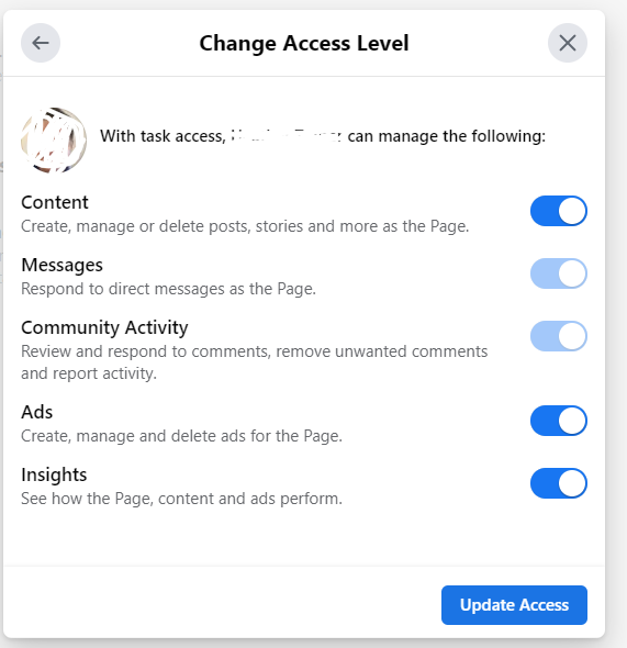
Task Access:
- Community Activity- Review and respond to comments, remove unwanted comments and report activity.
- Messages-Respond to direct messages as the Page.
- Insights-See how the Page, content and ads perform.
- Ads-Create, manage and delete ads for the Page.
Community Managers:
- Community managers can moderate chat comments, suspend or remove people who violate community standards and see all admins of this Page.
As Facebook continues to make changes to the “New” Facebook experience, I would make a note to keep checking access levels and who has access to what. When the changes first rolled out last year, anyone who had any kind of access level to a page automatically got bumped up to “full” access. It appears (I hope) that they have fixed this and added additional levels and options, which is great.
What is not so great is that anytime Facebook makes a change, especially to options in the administrative section, they don’t tell anyone about it. I’ve been tracking the changes with the roll out to the new format since last year, and as usual, anytime a minor (but sometimes very important) change is made to business pages, they don’t make any kind of point of informing users about it.
Even worse is it appears they have now totally deleted the holding period for deleting a page (definitely moot if you don’t have access to it anyway, but….). In the old version, You’ll have 14 days to restore it in case you change your mind. After that, your Page will be permanently deleted.

Old Page Version
In the new version it looks like once it’s deleted, it’s gone.
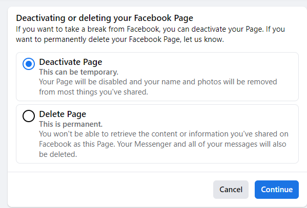
New Pages Experience Version
While it’s a lot harder to actually dig down to where to get to delete the Page in the new version vs. the older version, this is still NOT a good thing. So please stay on top of your access levels!
Tied into this, you think your personal Facebook account got hacked because you started getting reports from your friends that you were sending weird requests or odd messages to them.
There is a huge number of fake Facebook accounts, far more, I think, then Facebook will ever admit to. With the fake accounts, they take the name of someone, create a new account, and then take the profile picture and header image from the person they stole the name from and use it on the fake account.
They then target your friends (because your friends list is open to anyone logged into Facebook) and start sending them friend requests. Many people accept the request because they see a name and photo of someone they recognized, so they don’t necessarily remember if they were already connected and hit accept. This is the way these fake accounts spread. Most people automatically assume they have been hacked, panic, and change their password. No, folks your account has not been hacked; it’s been cloned. Have friends report the fake profile ASAP. You need to lock down your friends list and also be very aware of what you post.
How can this hack your business account? It usually doesn’t directly, but it can cause identity theft of both your information and your friends’ information, and an awful lot of people have gotten scammed from these both identity-wise and financially.
And I do know two businesses that had employees that got their employee’s Facebook personal accounts cloned. The fake accounts messaged the owner of the business pages they worked for, and the business owners granted the fake accounts access to the business page, thinking they were the real employees and then had hacked pages and deleted pages. One more reason to limit access in the backend of Facebook.
Locking down your friends list and near the end (because it’s in the same section) how to see what apps have access to your personal (and business account with that).
by Heather T. | Sep 6, 2022 | Business, Marketing
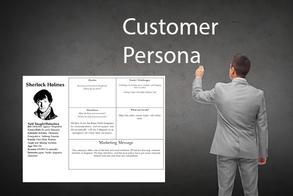 Last week I ran an online workshop about how to create a customer persona. As part of the workshop, I touched on how businesses can use the power of social media to data mine social media profiles for information, and I wanted to elaborate on it a bit.
The internet is a very scary place, and I don’t think people truly realize how much information is out there for public view.
A perfect example of this is every year when we lived in CT;
I used to run a class for the Middlesex Library, which had a jobseekers program, Social Media for Jobseekers.
Every year I would talk about how with a bit of Googling, how much information was out there online for HR, for companies, and for recruiters to be able to see without even digging that hard or violating any privacy.
In every group, I’d get at least one skeptic: “You can’t find anything out about me; I’m not on any social media channels!!!!”. And I would have them give me their name, the town they were from, and nothing else. I’d say, “Give me a minute on Google, please.”
So “Bill,” you are a long-time member of Rotary, you went to UCONN and studied meat science, you like fly fishing, and you are extremely unhappy with the customer service at XYZ brand. You love to order dog toys from Chewy, and you coach your middle school daughter’s soccer team. That’s only page one. Would you like me to continue?”
Now put that information into a persona (that’s not even including social media data mining), and that’s not even digging very hard.
- Rotary Member (likes to give back to community and volunteer)
- UCONN graduate (large college with an extensive alumni network)
- Meat Science Degree (probably currently works or formerly in the food business, probably wholesale)
- Likes flyfishing (outdoors person, likes to spend time alone (supposition)-passionate about it as found multiple flyfishing forums he belongs to
- Shops at XYZ brand quite a bit.
- Does not like bad customer service (15 bad reviews about it, 40 good reviews about positive customer service experiences)
- Has a dog or dogs
- Has at least one child (A daughter who likes to play soccer)
- He probably purchases soccer apparel for his daughter, who is in middle school and does not have the funds to purchase them herself.
Now how much more can you dig out just going past page one?
Now, let’s see what we can dig out on Social Media. A goldmine, actually many gold mines on top of the one Google gives you. Facebook is a wealth of information, and sadly (but good for businesses), not everyone has their profiles completely locked down.
I’m going to use a friend as an example; I looked at her account through the account of someone she is not friends with to see what information is public to someone logged into Facebook.
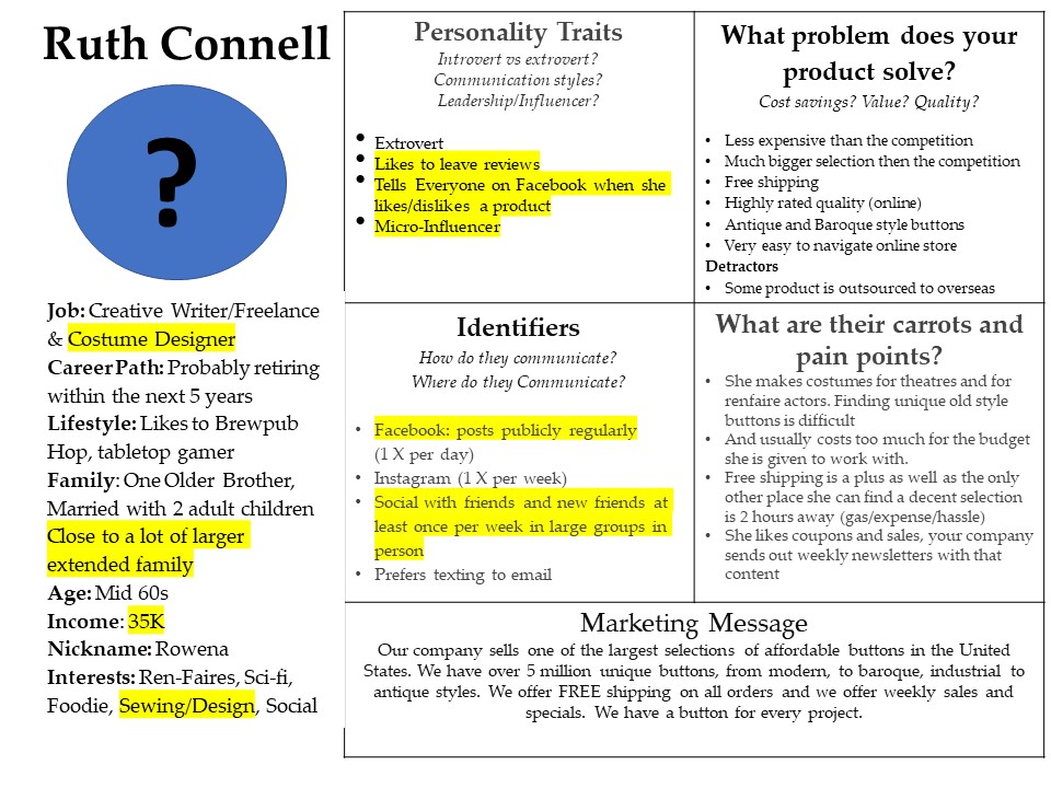
I can (publicly/logged into FB but not friends with her in this case) see that she is a creative writer, a former reporter at a local paper, she studied communications at XYZ university, she studied “partying” at another university, she went to ZYX High School, she’s married, and she currently is a costume theater designer and likes renaissance fairs (including making costumes for ren faires).
She also has some posts not set to “friends” only; she likes brewpub hopping with her husband and a large pool of friends. And she’s a board game addict.
She is from New Jersey, currently lives in Pennsylvania (Town specific), and moved there about 30 years ago.
She is also on Instagram (Insta handle provided), and she posts daily on Facebook, only about once a week on Instagram. (so Facebook would be a good target for her, but probably not Instagram. I have no idea if she is on Linkedin or Twitter (because I haven’t looked yet).
She identifies as female, a Gemini, her religious views are Buddhist, and her political stance is Progressive. She frequently shares her husband’s political posts, who is clearly not a republican or a fan of a past president.
I can also see where she’s checked in on Facebook: breweries, bookstores, national parks, cosplay conventions, ren faires, theaters, Indian restaurants, etc.
I can see what kind of movies and TV shows she has indicated she likes, as well as books and a whole lot more information.
I used a fictitious button company (The Button Store, over 5 Million Buttons!) as the business that would be building a persona based on my friend.

A real persona, if you were going to do one for a company, would include a lot more research on people and a lot more data mining of other profiles, but I wanted to use this as an easy example.
Let’s move on to the other social channels: Linkedin also has a lot of information, not just in people’s bios, but what groups they belong to, what interests they have, their backgrounds, who they are connected to, and what they post about.
Instagram and Twitter (I’m not going to include TikTok because of the primarily younger audience, and I wouldn’t UNLESS that was your target market) don’t have as much information at first glance to glean.
But you can tell who they are following, who is following them, generally if they have other social accounts, where they live, how often they post, what they post about, and in Twitter’s case, what they repost and who they converse with, etc. You can find some of that on Instagram, but it doesn’t have the native reposting option that Twitter does.
While this may seem a bit creepy, big companies do this all the time, and it doesn’t stop a small business from using the same data mining techniques. It’s just time-consuming, you are looking for information that is already public.
For small businesses and anyone who uses social media media, I would VERY much encourage people to look at what they post and the specifics of what people can see. Google yourself, too; it’s always eye-opening.
I’m not going to go on a rant about locking down everything again (done that enough in the past) ,but please be cognizant of what’s out there.
From a small business perspective, if you want to make accurate customer personas, set aside 5 or 10 minutes a day, do some Googling, check out some social profiles, and compile information. Please don’t do a generic persona, do as many as you need for your business and customize them to suit.
Hubspot has some great resources I suggest you check out if you are just starting to create personas for your business. When doing your research, don’t forget to check out people’s reviews on Google, Facebook, Yelp, and Tripadvisor, as well as any other review sources you can find. You can glean a lot about someone from their reviews.
HubSpot Resources
https://offers.hubspot.com/persona-templates
https://www.hubspot.com/make-my-persona
https://blog.hubspot.com/marketing/buyer-persona-research
(How to Find Interviewees for Researching Buyer Personas section And 20 Questions to Ask in Persona Interviews are particularly helpful)
Some additional articles you may find useful
https://www.semrush.com/blog/buyer-persona-examples-beyond-basics/
https://buffer.com/library/marketing-personas-beginners-guide/
https://blog.hootsuite.com/buyer-persona/
To use the example of “Bill” in the beginning of the post, good customer service is a sticky point for him. If you were going to use him and say 15-20 other people to create a detailed persona, what could you put in your persona to elaborate on that? And how would that make your company stand apart from the competition? Is this a person/persona that would pay more for terrific customer service? Travel further for it? Prefer to use email or phone rather than shop online for it? What can you glean from what people are telling you? Use Google and the Social Platforms out there to create your personas, don’t just make them up based on what you think should go in there.
 We recently had a chance to take a little time off and rented a VRBO for our kids and grandkids to come and stay for a few things.


 In some ways, I’m a bit of a Luddite; I still dislike my cell phone (I had a Tracfone for years until I was dragged literally kicking and screaming into the 21st century a few years ago). I still use a paper calendar for scheduling my week (this is more that my brain can’t process things in a digital format for scheduling and try to find room to breathe occasionally. I like being able to visually lay out my week and schedule meetings and workshops where I can find time to do work in between them). But I digress.


 Last week I ran an online workshop about how to create a