by Heather T. | Nov 9, 2021 | Blog, Marketing, Operations, Social Media
 This is an updated post on one I had done way back in 2010 (yikes it’s hard to believe that it’s been over decade, but still relevent) with bit more information and a couple of additional ideas.
I thought it might be time to update it, as it’s one of the most common questions I get from people, even when I tell them you know………. there are a ton of ideas and post ideas out there already floating around and don’t forget to look at what your competitions doing,
Sometimes people want some more specific ideas, so I thought it was time to give the post a little spiff up. I do find it kind of amusing that the old post refered to “fan pages”, Facebook’s original name for a business page.
(Keep in mind many of these could be in visual or image formats including video) Many can also be used for blog posts with some additional information and content. Visual/Image posts are best for Instagram. Linkedin business and personal pages, Facebook business pages and groups, and Twitter, it is best practice to try to share an image with text.
*Don’t forget to share links to your website often as well.
The number one mistake in using social media is forgetting to add targeted links to posts. People will not look for your website link if they don’t see it in the post itself.
If you have a product or service, you are promoting on social media make your links count. If you are talking about a particular service you offer, have the post link go to your services page where you talk more about the service, NOT to your homepage, you don’t want to make people have to hunt.
- A promotion.
a. Come and stay during the month of March and get two free ski tickets.
b. St. Patrick’s Day Special, get a complimentary green beer & popcorn with an order of bangers & mash (*must be 21) = 117 characters, still room for using a shortened link on Twitter.
c. Get double points on your Ace rewards card with every hardware purchase the first week of March.
d. With a purchase of any Don Fredo jewelry, get a free earring cleaning kit.
e. Get a full hair coloring treatment and receive a free trim.
f. At your next tire alignment, get a free oil change.
g. New accounting customers get a 10-minute free business analysis.
- A sale.
a. Thursday nights are half-price appetizers.
b. Sale though March 31 on Dunlop All-Season Radial Tires, save 20% off.
c. All Michelle Leslie tops and slacks on sale $15 off through this Sunday.
d. Stay 2 nights get the 3rd night 1/2 Off.
e. Two for one wool sock special every Saturday.
f. Mini-mart Super Gulps 99¢, 5-6 pm every Monday – Friday.
g. Photography special: Book a wedding with us and get an extra set of CD’s with your photos now through May 3.
- New products, services, specials, rebates, vouchers, offers, packages
- Recipes (recipes get one of the highest rates of pass-alongs in social media, if you are a retailer, share your Grandma’s killer brownie recipe and make it the next time you have a sale at your woodworking store. It doesn’t matter what business you are in. Also, Recipe failures with a funny story make great shared content.
- Guest, customer, or client comments or testimonials (with permission if sharing the full name).
- Your business in the news.
- Your business is getting or received an award.
- One of your employees is getting/or gotten an award, even if it’s of your creation, i.e., best salesperson of the month.
- Your area in the news.
- Promote any upcoming events. Open Houses, classes, workshops, webinars, networking, etc.
- A frequent and loyal guest, customer, or client in the news, please be aware of privacy though, depending on your business, a client may not feel comfortable with you sharing the information unless you know them well, it’s best practices to ask if it’s ok.
- Pictures of your business, interiors, exteriors, products (if applicable).
- Pictures of your employees.
- Pictures of happy guests, customers, or clients (with their permission and preferably in writing or verbally but documented).
- Area Events going on, you can also tie this into specials and promotions you are holding.
- A brief, “we get frequent questions “about” and put in answers.
- What does your business do to differentiate itself from others.
- Holiday Posts, a nice graphic or photo and a wish for a Happy Thanksgiving or other Holiday.
- You just found a new product you are using and love it, be it food or a new fabric softener or a new electric cordless drill; describe it and explain why you love it.
- Day of the Year posts. National Calendar days. May 20 is National Rescue Dog Day. It’s helpful if it ties into something related to your business. Two of your own dogs are rescues. One of your employees volunteers at the local dog shelter.
- Funny Loyal Guest, customer, or client stories. *caveat: make them funny and only funny, proof heavily to make sure they are not harmful or negative in any way. While someone may go into the wrong changing room by mistake at a store, and it may have had very amusing consequences, it raises things like, “don’t they have locks on the doors?” (even if you do and point out they didn’t lock them).
- Do some product/area/service-specific reviews. You have a couple of apple orchards nearby. Do some write-ups on the apples, do some research on types of apples, link to sources. You carry a particular line of clothing or cordless drills or snow tires; what is special/different/better/unique about them.
- A bio of your self or other owners or management.
- Bios of your staff.
- Interview customers. Keep in mind using video is always a bonus.
- Interview vendors.
- Helpful Tips: examples: restaurants; a good wine, lodging; cooking/baking tips, realtors: home buying tips, Landscapers: gardening tips, mechanics: car care tips, drycleaners: stain removal tips. For every type of business, there is always helpful information out there that someone can use.
- Industry News.
- Ask for feedback from blog readers, fans, followers, and from prior guests, customers, or clients. You just went from goose down pillows to memory foam pillows. If asking on a blog post, ask for some thoughts from people, and don’t forget to include the link to the blog article or post link when you do your next email blast. You just switched from using Redken products to Matrix Biolage in your salon. People love to be able to give feedback and asked what they think about things; this is an excellent medium for doing that, exploit it. Questions asked are great prompts, and you can get valuable information on your own business or something new you may be considering doing.
- Help wanted posts.
- Lists. List posts get high engagement. 10 of our top selling products. 12 of our favorite woodworking bloggers, 15 tips on saving money, 7 best places to go to get Sushi, etc.
- Links to resources, also great in list post format. 10 places to save money on your business insurance.
- If you are blogging, don’t forget to share your blog posts on your Facebook business page, your personal Facebook account, Facebook groups (if it’s permitted), Twitter and Linkedin personal and business pages. If blog posts have images (highly recommended), don’t forget to pin the image (with your blog post link) to Pinterest if you use it.
- Videos from Youtube, Vimeo and Tiktok.
- PSAs, especially ones that are relevant to what’s going on in the world today. Try to stay away from politics or religion.
- A Non-profit or charity you support.
- Your business contributing to the community or donating a product or service.
- A giveaway, contest or drawing. Please make sure you check each social media’s T.O.S (Terms of Service) before promoting these online, each has different requirements and disclosures.
A few ideas for Business Social Media Platform Shares
(Facebook (Personal, Business & Groups), Twitter, Pinterest, and Linkedin (Personal and Business)
While Instagram does have external apps to share posts, PLEASE ask permission first of the Instagram author. On Youtube, you can add videos to “Playlists”
https://support.google.com/youtube/answer/57792?hl=en&co=GENIE.Platform%3DDesktop
and
https://support.google.com/youtube/answer/57792?hl=en&co=GENIE.Platform%3DAndroid
If sharing on Facebook from a personal account, please ask permission first.
- A gorgeous photo taken of your town, your area, your state (make sure the author gets image credit, shares from a page, or their own group rather than uploading a photo are highly recommended so you don’t violate copyright.)
- A vendor or a company you buy from shares something of interest related to your product or business.
- Funny or amusing content, try to keep it clean.
- Helpful tips (not the same thing as Educational content as these are generally short form posts) from non-competitors.
- Educational content. A blog post from a Leadership expert with a little of your personal feelings about why you liked it or something that stood out about it.
by Heather T. | May 18, 2021 | Marketing

So if you are like most people, you are going “WHAT!!!!!! Facebook Just Changed our Business Pages last year!” Well, folks, Facebook changes business pages looks/formats and options actually about once a year. Sometimes the changes are small, sometimes large, but they do a major revamp approximately every three years and then do some tweaking of settings and looks.
Recently, I had gone through old PowerPoints for workshops I had taught since 2011 and I had screenshots from a decade of Facebook changes. It’s pretty interesting if you have a minute, check it out!
Last year’s change was a major one; this year’s changes are not “quite” as dramatic but do change some things of note.
There have been a few articles written about this, but not many to date, mostly because the switch over seems to be extraordinarily slow for this conversion. Of the 100+ pages, I am an admin on, only two have been switched over so far.
Roaming around on Facebook daily as I normally do for business, I’ve only come across a few other pages so far that have switched. The option to switch does not seem to be connected to the page like count.
You can’t sign up for an early switch, and if you do switch, you apparently have less than a week to decide you want to go back to the old format but no information on how long you can keep that option. Since presumably, we will have to switch over the new format eventually, that one is up to you.
Read a bit more from Facebook about the new version.
About the New Pages Experience (from Facebook) and
Introducing the New Pages Experience (from Facebook)
I do want to mention some of the significant things to note if and when you switch.
- When the option is available, an email will go out to all of the admins and anyone else holding a page role that the new option is being enabled within 3 days. You (and anyone else with any access) will also get a notification in Facebook about it. Please also see notes a few bullet points down re: admins.
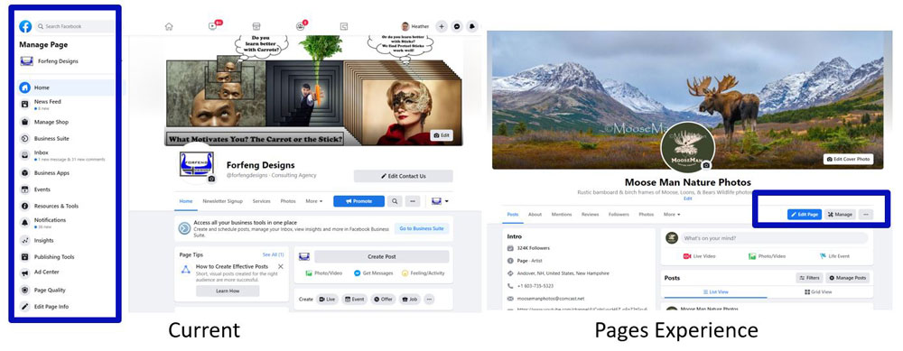
- The admin controls are moving to the top (again) right under the banner image instead of on the left.
- Instead of the page administration options of Admin, Editor, Moderator, Advertiser, Analyst, and Custom, this new version only has two admin options. The two being; People with Facebook Access, and People with Task Access. Admin access has full control over everything. Task Access has almost all controls, but it’s more limited. For more specific information, visit https://www.facebook.com/business/help/582754542592549?id=418112142508425.
- Important! Please note that of the pages I admin that have moved to the new format and from several other people I have talked to with the new format. Anyone with access below Admin level with the new page switch will become a full Admin. So your former editors, moderators, advertisers etc. will have FULL access to the page. Please address that immediately, as this also means they can boot you off the page and delete your page as well.
- Page likes go away, but page followers stay.
- Your banner “appears” to be the same size as it was prior, but your profile image moves to the middle of the page and looks like it’s slightly larger than the prior version.
- The new page is basically a “public” profile and has a lot of extra options, not quite sure why a page would want to have: hobbies, sports, TV shows etc., but hey someone I “guess” will find a use for them. The worst part of this, though is there is already some confusion between personal pages and business pages, which was bad enough before, but now this makes it worse.
- A note on the prior bullet point. Currently (for most pages), we have the options of switching page templates, plus we can also hide some tabs (most notably “reviews”). The new option takes away templates. You can hide some of the new options (book etc.), but it does take away the ability to hide the reviews tab and “so far” if you had any external integrations for tabs like an email signup through Constant Contact or Mailchimp or external app application like Woobox (which can bring other social media channels into pages as tabs with other capabilities) no longer. Those options are apparently AWOL in the new version.
- Insights also has some major changes going on. The detail you get now when you check insights is being significantly slimmed down. Facebook does this when this option isn’t used much by users. While there are plenty of people that look at Insights (Facebook’s page analytics), the vast majority don’t. I know this for a fact because 1 out of every 15 people I talk to per month on average about FB business pages has ever actually looked at the Insights. Facebook giveth and Facebook taketh away. I would suggest if you have any interest in tracking past posts, videos, photos, etc. in-depth, you download the variety of data available, and do a last download before switching over to the new format. You can only download the data in 3-month increments, which makes it kind of a pain, but well worth it to be able to have that information if needed.
- I’d also recommend downloading/backing up your page information. While there have (so far) been no reports of data loss or loss of other content. It doesn’t hurt to have a copy anyway….. We had written a post about this prior. Steps to Backing Up Your Personal and Business Facebook Pages.
- Some information from your “About” section does not migrate, so with the page switch you may want to review any information that you had previously, including hiding some of the tabs you might not find applicable or appropriate.
- With current pages, you go to the left and find “Pages” in the list. In the new version, You will switch between your personal profile and your page or pages on the top right, but they don’t call the new version pages anymore, it’s now profiles. (Just to confuse people even more).
- On a smart phone, when you log in to the regular Facebook app it seems to automatically bring you to the page (or in my case) one of the pages I admin, instead of my personal profile so you need to switch back to use your personal account. This may be unique to the iPhone app as I talked to one other person with an iPhone that was running into the same thing and a client with an android phone who had the switch done didn’t think it was happening to him but he is rarely on Facebook.
- This, I think currently is the most annoying thing about the switch. In order to run an ad or schedule a post, you need to switch back to your personal profile to do so. You will also administrate some things through Facebook Business Suite.
I do want to add one more thing of note that Facebook has done without apparently telling anyone. Your formerly private personal accounts (ie, personal profiles), that it used to be someone had to be logged into Facebook to see anything from your account, like your banner photo and personal photo are now public to the world, i.e. people not logged into Facebook at all.
From a business standpoint, this may be a plus; on the other hand, it does expose not just yourself but also any friends who have commented on a personal banner, it allows access (view) to their accounts and makes their comments public to the world. Clicking on the Likes/Loves does not bring someone (not logged in) to a user’s account, but a comment does.
You may also want to see what else is visible now to the whole wide world. Capture your URL, so https://www.facebook.com/yourusername and either open up an incognito window in Chrome, log out of Facebook and put the URL in, or open a browser you don’t use for Facebook and put the URL in. One of the reasons this blog post is titled Jeepers Creepers is because Facebook continues to let the world see your life, whether you want them to or not. Please do note though, there is a fairly new option on your personal profile to add a short line of text plus a website URL, this is public on your personal profile while not logged in. So take advantage of this if you own a business.
I suspect more changes are coming, and I’ll add another post as any new developments that are important for a small business to stay up on are rolled out.
by Heather T. | Apr 21, 2021 | Marketing, Operations

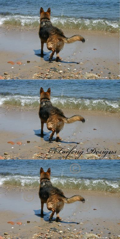
On the second two photos you can see a watermark, see one on the first one? No? But it “might” have a digital watermark.
As anyone who has sat in on one of my workshops or seminars and heard me stress the importance of making sure any photos you use on your website are legal, this will be preaching to the choir. If not, I want to revisit this for anyone who has not heard me rant about the importance of checking provenance.
What IS the provenance of images? Making sure you know where they came from legally.
In the last few years, I’ve lost count of the number of people who have run into copyright-related issues because they, OR their website developers, have run into an issue with copyright and photo/image usage.
If a client provides a photo to a web developer for use on the client’s website, the client is clearly at fault and needs to work with the photographer and/or agency to resolve the copyright claim.
Unfortunately, some web developers also provide stock photos (provenance unknown) for clients’ websites. The client gets hit with a copyright suit, and the web developer does not take responsibility for it, even though they were the ones who supplied the image.
A few more things to note, this can also happen when a web developer (legitimately) buys stock photos for a website. Then a client transfers the site away from the web developer to someone else and doesn’t obtain the licensing information for the photo.
Or the photo is obtained from a “free” stock photo site, and the site is not 100% safe (I’d say most of the free stock photo sites are questionable) because who knows if the photographer claiming ownership is the owner) and you also can’t see what’s called a Digimarc watermark or other types of invisible-to-the-eye watermark systems. Many copyrighted photos have tracked back to Getty Images from free stock photo sites, so I tend not to trust any of them.
I’m particularly anal-retentive about photo copyright because many, many years ago, when I was still doing website design, I obtained a photo that I thought was free and clear from what at the time was a legitimate free stock photo site and used it on a client’s website.
My client received a cease and desist letter from Getty Images, and even though we removed the photo immediately and provided documentation about where the photo was obtained, they still sent collections after her. And the collections agency was calling the inn literally every hour during the day to harass her.
I paid the fee to get it cleared up, because it was my fault for providing the image. Since then, I’ve lost count of the hundreds of people coming my way and looking for advice having run into similar problems. Either they used a copyrighted photo unknowingly or their web developer provided a photo or in a couple of cases, multiple photos and they got nabbed for it.
Very recently, a related issue came up, and this topic reared its ugly head again, so I thought it would be a good time to revisit this.
A website that myself, one of my clients and about a dozen other commercial photographers had a written agreement with an association that in order to use our photos, there were to be photo credits with links back to our websites on the website itself and this was done prior.
The website recently got redone with the new web developer not transferring any photo credits for any of the photos.
I won’t detail the issues and communication that arose from this, but my photos and my client’s photos (which was my primary concern) were removed from the new site as this issue did not get resolved to our satisfaction.
Unfortunately, dozens of other photos remain that need to be credited to the other commercial photographers. If my client had caught this before I had, he would never have reached out and tried to get this resolved; he would have just sent them a cease and desist letter/copyright infringement notice plus tacking on usage fees.
I know some of the other photographers that contributed photos, and I suspect they would and may do the same. I did my due diligence and let both the site owners and web developers know about this, which has not yet been addressed looking at the site this morning.
What bothers me most about the recent issue is that one, the web developer not only failed to transfer the photo credits in the first place. If they were on the old site (which they were) that it should be common sense/a good legal move, to move them as well.
Two, the web developer did not even bother to check the provenance of the photos.
Three, and this is a little detail from above, when asked to give photo credit, added photo credits to photos that were not the photographers, leaving the photographers open to liability for copyright infringement themselves.
For businesses, the takeaways should be:
- Know where you got your site photos. Are they documented? Are they legal? If you have photos on your site that you have had for years, and you are not sure where they came from, it doesn’t mean your safe; it just means you might not have gotten caught yet. Sometimes it can take years for a copyright issue to come up.
- If a web developer provides photos, where is the provenance for them, and will they take responsibility (they should!) if a site they developed for you gets hit with a copyright infringement claim for an image or images they provided? If they refuse to when asked about this issue (and I’d get this in writing), you need to use your judgment about whether that’s someone you want to use as a vendor.
- If you switch web developers, keep in mind you need to either get provenance of any stock photos that the prior site developer has provided for you or replace them with new ones that you know are legal.
- if you buy stock photos from a stock photo site make sure you take a screenshot of the site with the page that photo is getting purchased from including the licensing information. Document, document, document. Sometimes photographers remove their photos from stock photo sites and then do image searches or unscrupulous firms do searches for them (unknown to the photographers). If you have proof it was bought legally, your in the clear.
- If you do source photos from free stock photo sites, include the URL of the page the photo came from and screenshot and date the screen of the page it came from. This won’t protect you from one of the big stock photo companies but may help if a private photographer claims copyright.
Here are a few sites where you can do a reverse image search on your images.
https://tineye.com/
https://www.labnol.org/reverse/
https://smallseotools.com/reverse-image-search/
by Heather T. | Dec 23, 2020 | Marketing, Social Media
A common question I get from friends and clients is what happens if my business page or personal account gets deleted or I get locked out or banned from Facebook? Well in some cases it can be recovered, but in some, it can’t. Most of the concern understandably is about photos that might have been uploaded to a page or profile from a mobile phone and in many instances the copy on Facebook is the only copy.
From a business perspective, it’s not just photo loss, but what if you want to find a copy of a post from last year? Or two years ago? You can sit there for an hour plus and scroll back through all the posts in your insights, but having done that myself several times looking for past post information, set aside an extra hour (or two) to be able to find something, It’s ALOT of scrolling. Being able to download (and sort easily) that information can be very helpful.
Let’s start with the Facebook personal page, Facebook changed how you get to this option fairly recently for both profiles and pages. The last time I reviewed this was back about 3 years ago and there are some definite changes plus it’s always a good reminder.
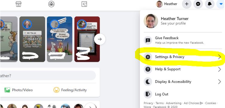
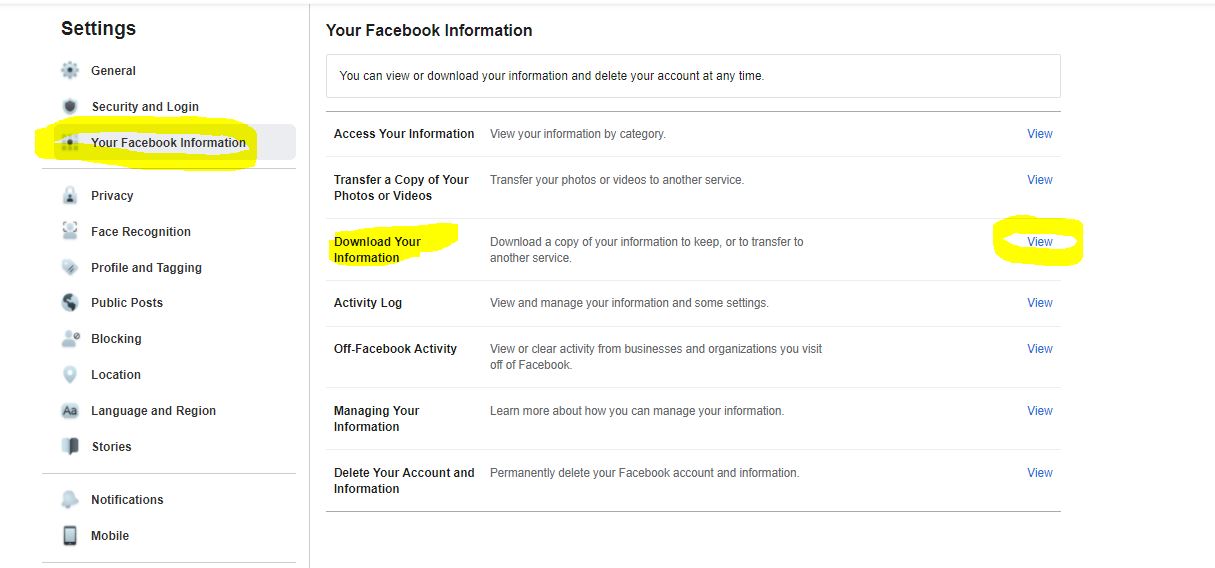
Step one for a personal profile: Go to the top right of your Facebook account and click on the small downward-facing pyramid to “Settings & Privacy”

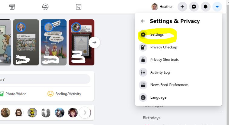
Step 2: Go to “Settings”

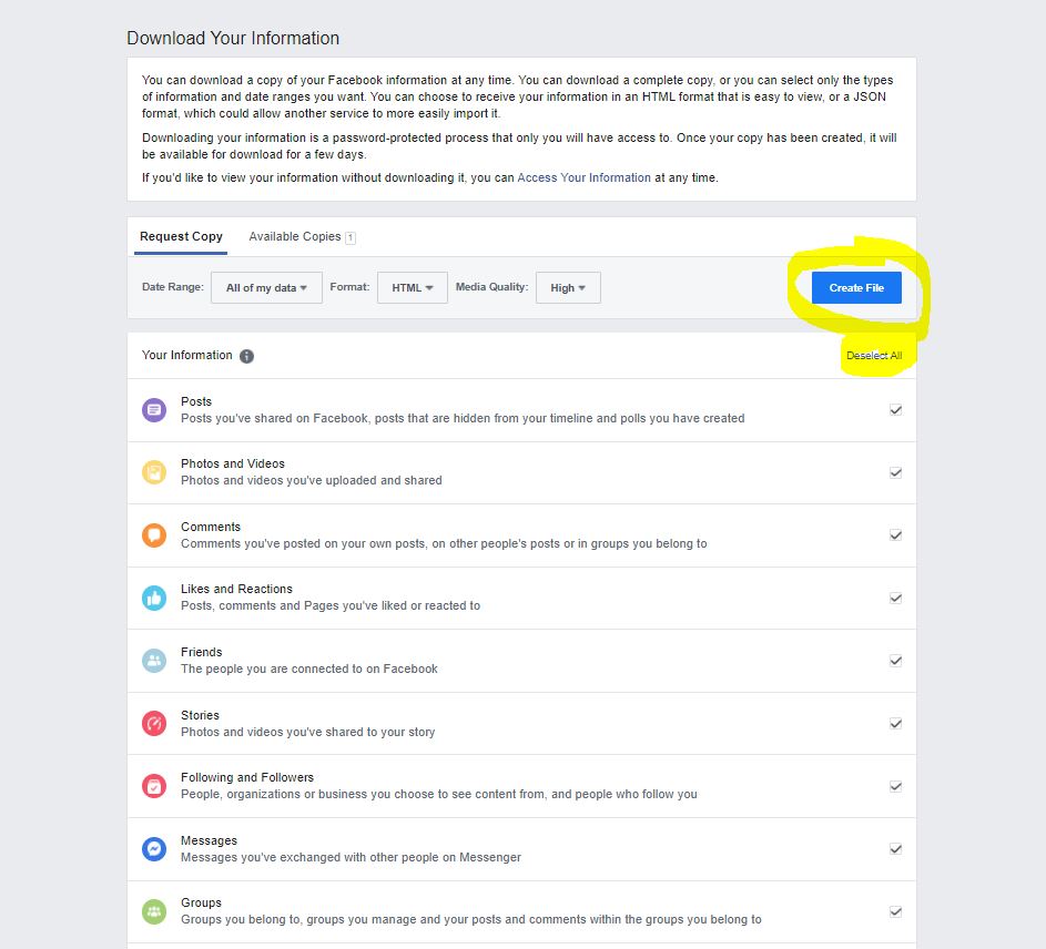
Step 3:**** Go to “Your Facebook Information” and than “Download Your Information”

****Facebook frequently changes the options (and many of the settings) in the backend of accounts without letting anyone know, I highly recommend Facebook users go and review what the options are in here at least once quarterly if not more often.
Step 4: if you have everything selected, be warned, it’s going to take a long time to process. So deselect all and than do the ones you have an interest in backing up.

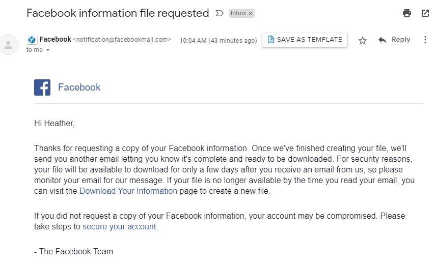
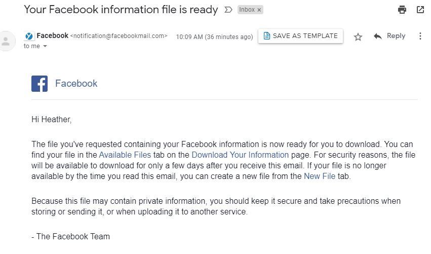
You will get two emails from Facebook, the first saying it’s processing, the second will come when your Zip file is ready to be downloaded. You will also get a red notification on the page above when it’s ready. If you get the second email saying it’s ready and you still had the above page open and it says “pending” refresh the page on your browser.


For a business page:
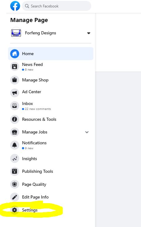
Step 1: On the left hand side of your Business page when you are on as an admin, go to “Settings”

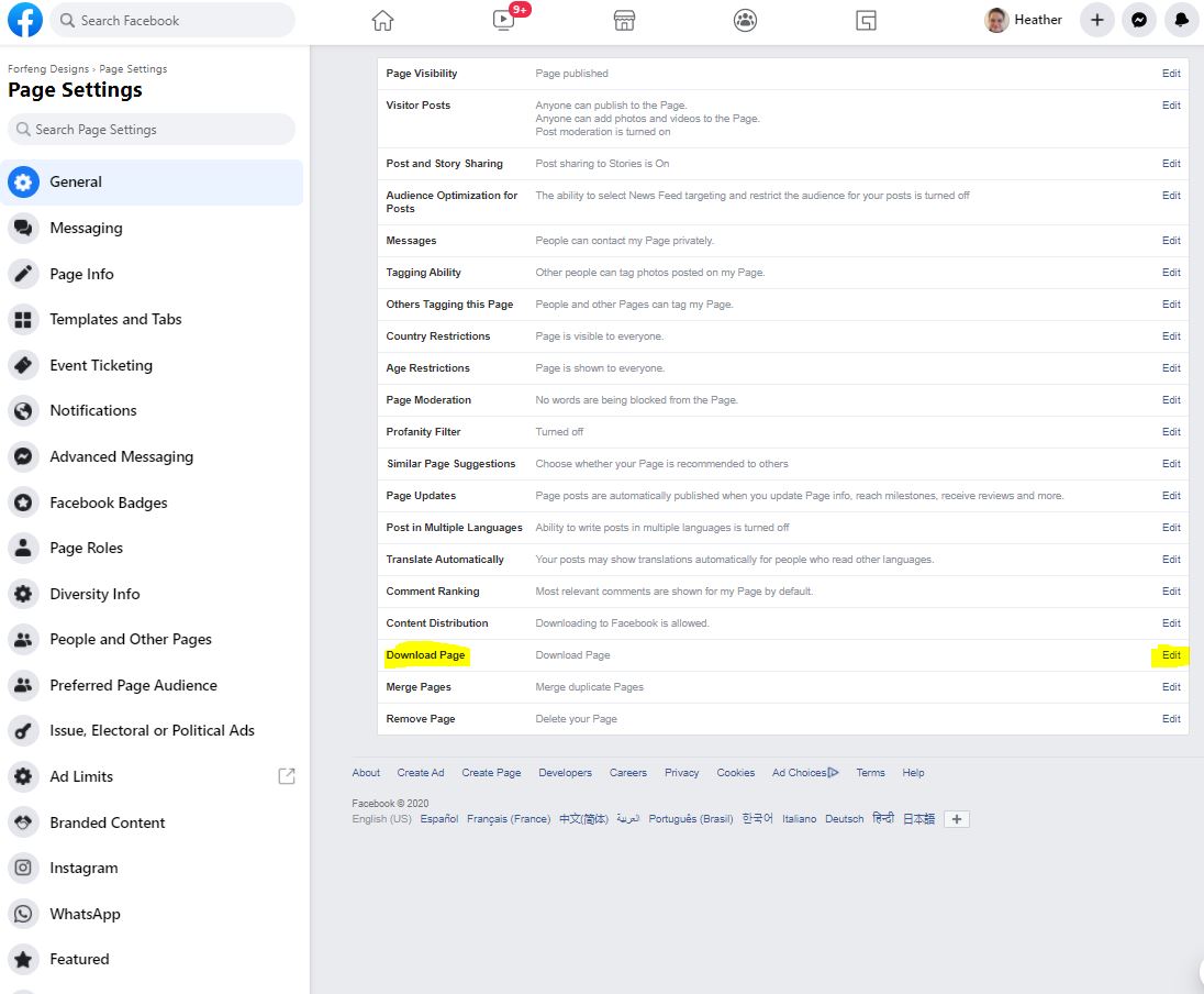
Step 2: On the General tab, go to the middle of the page to “Download Page” and than “edit”. When you click on that there will be another option to hit “Download Page”.


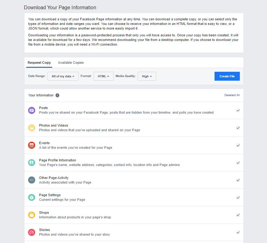
Step 3: You will get a very similar looking page to the personal profile options, but it will say “Download Page” at the top to make sure it’s being differentiated from your personal account.

I’d recommend doing this at least once per year for both personal and business at the very minimum, I do this quarterly for any accounts I admin as the last thing you want to have is information that is not recoverable in any way.
I can’t stress enough the importance of backing up not just your social media information but all of the information on your computer on a consistent basis. I’ve talked to so many businesses who say they know they should be doing it and don’t and very much regret it when their computers fail, they have a break-in and their equipment gets stolen or there is a disaster like a fire or flood. If you are on of those people who know you should be doing it, but don’t, I would ask you to ask yourself, “Can my business function and how long will it take (and can I, and my business) recover, if my information is lost, maybe irretrievably forever.
by Heather T. | Dec 9, 2020 | Bed and Breakfasts, Blog, Marketing, Operations, Social Media
 About 4 years ago I had written a blog post about Planning Ahead for Your Bed and Breakfast Promotions and this ties into the new calendar I’ve put together (below) and your content scheduling, or you can adapt or just use one format or another. Here is the online spreadsheet from that post (don’t forget you can download it and it does have multiple tabs). Tips on downloading or copying if needed near the bottom of the post.
At the beginning of this year with Covid hitting and B&Bs being closed or having a limited business, the big question was what to post, so I had designed this campaign with posting ideas https://betterwaytostay.com/campaign/. And the idea can still be used at any time.
I’ve had several questions from friends and other B&Bs if I was going to do the annual National and other Days of interest list that I do once a year compiled from a bunch of sources around the web. Since I had just finished next year’s calendar I am happy to share, but I also added some other tips (in the additional documents in the post) that might make posting and figuring out when to post for specials and other events (like Holidays) a bit clearer and hopefully easier.
It’s much easier to take about an hour at the beginning of the year, if not before, and develop at least a rough outline for your content calendar for the year and add to it (or subtract) as needed. Here are some content calendar ideas that I hope will help you start to develop a content calendar. The National Days is just a starter and I know every marketer under the sun pushes it, but it is admittedly a great “starting” point. I spent about 4 hours collating National, International Days and other Days of interest including as many food ones as I could find. This might be useful for restaurants as well looking for a few ideas to post. If you know of any I missed please let me know and I’ll add them in.
National and More Days for B&Bs (with some specific days as prompts)
National and More Days for B&Bs (no selections/prompts)
Calendar Example for a B&B. This is an example of a property going through the list and leaving the ones they might be interested in using for potential posts or blog or video posts. It doesn’t mean a property will do them, it just means a property found something interesting in the list, something that speaks to them (military family), a love of fun (Soylent Green Day or UFO Day for those with a sense of humor and love of Sci-fi), particular food days that resonate with things the B&B serves for breakfast, etc. Note this list is 11 pages pared down from 17.
Calendar Example for B&Bs with Specials. This is an example of preplanning your yearly calendar for posts and promotions that can be used stand-alone or in conjunction with the spreadsheet mentioned at the beginning of the blog. I only did the first couple of months but hopefully, you can get a good idea of how to go about adding information both for notes for yourself and scheduling posts for any ongoing specials or holidays you want to promote.
This is a PDF fillable calendar. (please download to fill) that you can fill in and print off or just print off and write in ideas (note please save it as a separate document or it may not save any inputted text). I would suggest making a checkmark next to the ones you’ve done, plus making any notes about engagement, likes, shares, and comments, these will help direct you in the following years if you want to do similar posts or promotions.
Content Calendar Sample Format. If you prefer a calendar type format instead of a spreadsheet or word document for figuring out your posting schedule you can use a format like this. There is no wrong way to do this, you find the format that works the best (and easiest) for you and go from there.
Blank Calendar-Sample Tracking. (I like to track likes, comments and shares on a seperate sheet, but you can also handwrite if that works for you (see below example). It helps if you note what you started with for each channel and ended with for each channel. Facebook January 1-352 Likes, January 31-386 Likes, etc. this will help you track progress and you can review quarterly to see whether what you are doing is actually working or not.
Content Calendar with Handwritten Notes *note circles mean a link to the inn’s website main or sub-page or blog post on the website.
Something some B&Bs don’t do is link to their website or a specific page on their website in posts at least once a week. If you are wondering about conversions and clicks from social media (and why you are not getting many or any) it’s something you need to look at.
I was talking to an innkeeper earlier this week and she was complaining that while her posts on Facebook were getting a lot of engagement, she had not gotten a single click through from Facebook in more than 3 months according to her Google Analytics. Not one of her over 100 posts had a link to the website in the post body itself. People tend to forget once someone has liked a page, the only link (unless you remind them in the posts that show up in their Facebook personal feed) to your website is back “on” the business page itself. People will not double click to search for the link.
I’d also recommend checking out You Need This 2021 Marketing Calendar [Free Templates] and his spreadsheet of helpful links and dates which does have things like the NHL Winter Classic, PGA Tournament of Champions, and the Grammy’s dates if these are things that you want to tie into your marketing but does not have the majority of the food dates that mine does. My calendar has most of the same information plus food but is missing sports and TV related events.
If you find any of the information above useful, we always appreciate a follow/like on our Facebook page (we don’t post a ton there as I personally prefer being able to chat with people but I am on FB pretty much all day during the week and your welcome to message me anytime) but would appreciate a page like and happy to reciprocate if you let us know your business page link, or you can connect on Linkedin or Twitter or just come say hello .
If you know someone that can use some social media help and would like to be able to learn it and manage it themselves (that’s what we do, we teach it) instead of paying an external company to manage it, please give me a call (860-326-0721) or email me, we are happy to help. Cheers and Happy Holidays. Please stay safe out there!
by Heather T. | Oct 23, 2020 | Food, Marketing, Operations, restaurants

Not a working QR code, just an example
This past Monday I ran a workshop session for my SCORE chapter, Restaurants, Mastering the Art of Takeout. One of the topics I touched on was QR codes and how restaurants and other foodservice establishments could leverage use QR codes in conjunction with Google Docs to be creative with their menus as well as offer things like reheating instructions for takeout to customers without having to add a printed piece of paper to the takeout order. I had written a blog post touching briefly on this topic last month, Tackling Some of the Challenges of Takeout Food for Restaurants.
Before I dive into some of the uses, there are somethings I want to touch on first. This is something I have been discussing with many of my own business clients for months.
If you are not familiar with Google Docs, it’s Google’s free online alternative to Microsoft office, there are also Google Sheets (like Excel), Google Slides (like Powerpoint), and quite a few more applications. I like using the online applications because you can share with anyone, share editing capability with anyone, access it from anywhere, and unlike desktop-based programs, which even if autosave is turned out, you may lose content if you have a power outage or other computer issue. When you add something in a Google Doc, it’s still there even if you get booted off the internet or you go offline for other reasons.
If you are looking for help with the Google applications, Google itself has a lot of resources, https://support.google.com/a/users/answer/9282664?hl=en and https://support.google.com/docs/?hl=en#topic=1382883 have some great tutorials. There are also some very helpful tutorial/help documents at https://edu.gcfglobal.org/en/googledocuments/.
If you are not overly familiar with QR Codes, this might also be useful. I am glad to see the resurgence of them because they had so many practical applications and were also often misused but that’s a topic for another blog, but if you want a laugh, this is probably my favorite UnMarketing video featuring Marketing Guru (and I don’t apply the term Guru lightly to anyone) Scott Stratten, QR Codes Kill Kittens. It looks like a session he did at one of the conferences he speaks at but sadly it doesn’t say which it. Scott is also one of my favorite people to follow on Twitter.
Before you create your first QR code, read the difference between both, and make sure you read the fine print before you set up and start using them in your business. I bring this up because many Dynamic QR Code creation platforms offer it as “free” but it’s not really, it’s a free trial or they don’t actually point out that heaven forbid you actually want to edit/change any links after you’ve created them…….you have to pay for them.
Static QR Code: A Static QR Code contains information that is fixed and un-editable once the Code has been generated.
Dynamic QR Code: Dynamic QR Codes allow you to update, edit, and change the type of the QR Code however many times you need, which makes them the best fit for restaurants and marketing purposes.
Back to the topic at hand ?
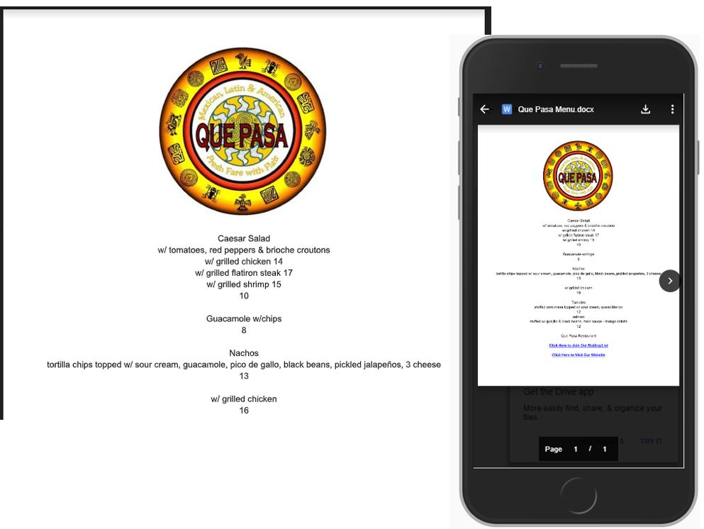
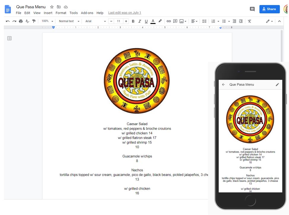
With many menus now only being hosted solely online and traffic driven to them in-house from QR codes or having to do daily printed menus for safety reasons, having an easily editable and also (and this is important) mobile-friendly version of your website is key. While you can tie your menus into online ordering if you want people to call or email or message you to make a takeout order instead of ordering through an app or website, being able to easily edit and change your menus becomes a higher priority, especially if you employ a web designer to maintain your website and who would charge you every time you wanted to make a menu change. While you can upload a photo or image of the menu daily or embed a word doc or other type of document, while it may look great on a desktop or laptop, it’s not generally mobile-friendly.
I bring this up because I’m seeing a lot of this recently. A mobile-friendly website with an image in it (the menu) that is too small to read on mobile because it doesn’t resize. Example one below, example two (Below that) is what a Google Doc looks like on mobile.


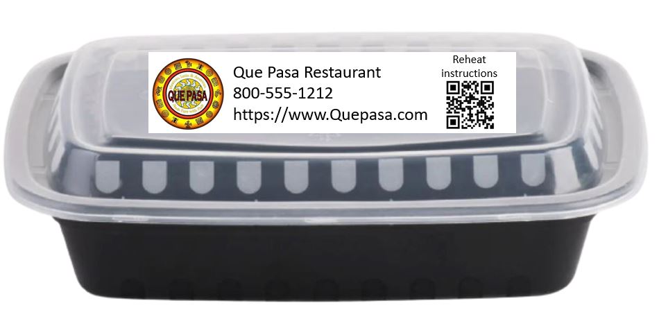
Even if you don’t want to use Google Docs for the above reason, it is something to think about if you are giving people heating or re-heating instructions for items, think about doing a Google Doc for menu items and doing a QR code with a link to the online instructions to reheat them. These QR codes can be easily printed off using an in-house printer and Avery labels and stuck onto the outgoing takeout containers. Whether you do one document that has general heating instructions for all, one that has individual heating instructions for everything that could be reheated on the menu (remember this is extremely easy to change the information online and an update is instantaneous) or customized documents for each with different QR codes is up to you. The QR code on the below sample actually works, any links to my Twitter account, come on over and say hello!

In a few weeks, I’ll be doing a follow-up Webinar for SCORE (these are free so I encourage people to take advantage of both SCORE national and regional/state offerings as they come up.)
 This is an updated post on one I had done way back in 2010 (yikes it’s hard to believe that it’s been over decade, but still relevent) with bit more information and a couple of additional ideas.
