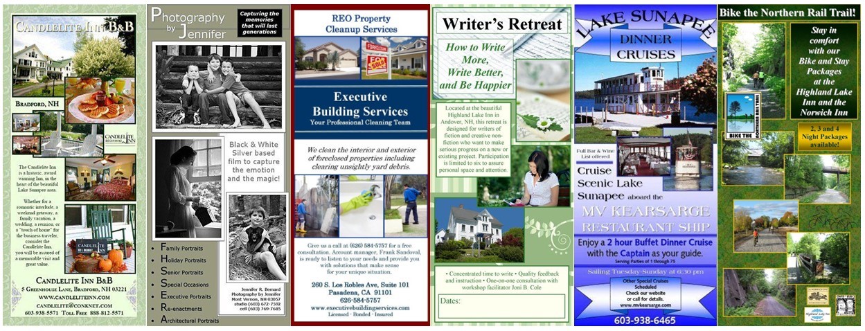
What are rack cards?
Rack cards are tall and narrow, generally measuring 4 inches in width by 9 inches in height. They’re often used to target prospective customers or guests in areas with heavy foot traffic, like tourist kiosks, tradeshows, or conferences.
The point of a rack card is to drive people to your website and to put as much pertinent information about your business in a graphically appealing way for people to pick up and either go directly to your website and/or take it home to investigate further.
What are some of the benefits of rack cards?
The major difference between a rack card and a brochure is that it’s generally cheaper to print a rack card. When people pick up rack cards, they’ll generally keep them around longer, too. Other perks? A rack card professionally designed costs less because it’s one piece of paper, usually double-sided, not three double-sided panels, like a brochure.
The paper they’re printed on is generally heavier (and if you are going with an online or local printer, make sure they use the heaviest paper stock available.) People will pick up a rack card and flip it over, look at both sides for information, and decide if they will keep it. If they pick a brochure or trifold up, they might often put it back, especially at a tradeshow or tourism kiosk when they don’t usually have two hands-free to look through it and open it up.
What are some key things to consider when designing a rack card?
The top half of the rack card is the most important. If you’re thinking of having your rack card displayed through a tourism distribution company to find out where the cards will be distributed, then do a drive-by (if possible) to see what the existing rack cards in those locations look like.
You want to see what kind of rack card holders they have and take some pictures. I’d also pick up other businesses’ rack cards to get ideas and to see what the competition is doing for advertising.
When browsing kiosks, bring a notebook and take photos of the racks. What attracts your attention? What doesn’t work (like the rack cards with names hidden at the bottom behind the rack shelf)?
When designing, keep in mind the top one-third to almost half of the card will only be visible, so make sure your business name and an eye-catching photo or image are at the top; a location for your business helps as well.
Business Branding
I’m a big believer that you should be consistent if you have established colors you’re using for your business. Your business cards, website, or anything you use for advertising. It’s super important to be consistent.
I’ve seen so many rack cards and brochures that don’t even have contact information on them, and that’s completely crazy, but it happens.
New businesses might have a website in development and not have any other branded materials done, they should identify the colors and fonts they like and stick with those. The promotional material should always be an extension of your business. I’d recommend you use two font choices and three colors at most.
If you don’t have a website done yet and you are under the gun to get some print material out, try to leave a bit of white space at the bottom of either the front or back of the rack card where you can print up your website on clear Avery labels and add later to the cards when your website is finished so if you have a ton of printed cards left you can use them up before having to re-print.
Photos
Always try to use photos; line drawings are nice, and they can have their place, but don’t put that line logo, if that’s what you use, in a prominent spot because photos are what drive people and especially what drives people to pick up rack cards.
I suggest businesses use photos that showcase their unique offerings. Try not to use stock images if possible, and if you are going to use them, make sure they are legally bought and not from a free stock photo site.
If using photos of clients or customers, it’s crucial to have permission to use them; a written photo release is highly suggested and imperative if using photos of children.
Before you get your rack cards printed, print out a sample and place it four feet from you, with the bottom half (and maybe a little higher) folded over so you can’t see it. Can you read the text? Are the image and colors eye-catching, or does it have too much detail for text and imagery, and you can’t see clearly what it is or what it represents?
Messaging
Have a headline and a tagline for the front. You really want your rack card to be a driver for people to get online with their smartphones right away or to scan a QR code and go straight to your website.
If using a QR code, make sure it’s static (unless you want to pay a monthly fee) and not dynamic. Static QR codes cannot be edited once created. Dynamic QR codes offer you the flexibility to edit QR code content as many times as you would like but usually require a paid monthly service to use them. Some QR code creator sites offer a free trial to use a static QR code and then charge if you want to edit it, read the fine print.
If you have a nice logo and/or if the logo has your business name clearly visible, go ahead and put it near the top or incorporate it into the photo. In the top part, you can also include a call to action, like “make a reservation” or “call now!“
I’ve seen some great rack cards that say, “Bring in this card and get 10% off”, or “Sign up for our online newsletter and get access to ongoing special offers or discounts.” It’s an incentive for people to take that rack card home too.
It would be best if you honored your promotion whenever that card/code is redeemed, so think through your offer carefully.
Aside from the top messaging, your rack card should include a short paragraph about your business and five to seven bullet points on the back. Make sure there’s plenty of white space. Try not to cram information or use too small a text; you are aiming for easy readability for every age.
Remember to include your business’s name, phone number, address, and website. If you’re active on social media, put a text link to your Facebook page and other social pages. Don’t just say, “Find us on Facebook,” or just put the icon for a social media channel. People want instant gratification, and the way social media channels and handles are, they may find a business with a similar name, not yours and they usually won’t bother searching if it’s not the right one. Put the actual full URL, i.e. facebook.com/janedoeinn or facebook.com/jane-doe-inn.
Try only to put in pricing if you know it’s going to stay the same. It’s OK to include a price range and point readers to your website for more information. However, printing your exact prices may mean you’ll have to incur printing and distribution costs frequently to keep your rack cards up-to-date or have someone insist that your business honor something in print. A price range provides you with more flexibility or putting no pricing at all.
Printing
In terms of printing, make sure you print in a matte finish despite the lure of ‘glossy.’ Tourism centers have exterior light coming in, and the gloss finish causes a reflection. Trade shows are frequently held in very large areas with bright light that can cause reflections.
Once someone picks a rack card, they’ll see your complete design but if it’s in the holder and your card is competing for attention, you’ll get a lot of reflection from natural and fluorescent light that may hamper your chance with that prospective customer.
As mentioned prior, You will also want to invest in a heavy card stock. You will see people in some tourism centers pick up a rack card, and if it flops (because whoever made it wanted it printed on lighter paper to save money) they may put it back. It negatively affects that first impression; if it flops over in the rack card holder itself, people generally won’t pick it up.
Remember to proofread and proofread again and again. If you have staff, ask each person to read it and proof it as well.
Last but not Least
Consider cross-promoting, if there is an associated type business that might send you business or a related business, trade your brochures, rack cards, and business cards with them. Restaurant to Lodging and vice versa. Massage therapists to Body Care stores, Riding and Horse Stables to Tack and Horse supply stores and vice versa, etc.

Great tips
Thank you Leslie 🙂
Thank you Janice 🙂
Always a wealth of information from ForFengDesigns- this time an in-depth analysis on Rack Cards. Who knew? Glossy vs. Matt and Heavy Card Stock, Static QR Codes, Photos instead of Line Drawings, Call to Action, etc. You covered it all! This is a keeper for my next rack card printing. Thank you Heather!
Excellent info, Heather!!! You’ve covered everything. Next time we print, I will use matte finish. I didn’t think about the reflection. Thanks, as always for your expertise.