A recent inquiry from an individual interested in gaining insights into my approach during restaurant audits inspired this post. While I can’t disclose specific client information due to confidentiality, I can give some examples of things I typically assess when evaluating a restaurant or other hospitality establishment.
It’s important to clarify that this pertains to my private business clients, not those from SCORE mentoring.
Whenever my husband and I dine out or when I’m out with friends or business associates, I tend to analyze various elements of the dining experience, including visuals, menu offerings and design, food quality, food presentation and service. It’s hard for me to turn off the evaluation gerbil wheel in my brain. But at least I’m easy to get along with while dining out because the food has to be really, really bad for me to complain.
I gave some examples of a recent dining experience my husband and I had, highlighting aspects I would typically take note of during a restaurant audit and thought I’d put them into print.
Please note that this covers only the front-of-house visual aspects and doesn’t come close to a comprehensive audit, which includes over 200 touchpoints or the examination of kitchen operations and food quality.
I always encourage owners and managers to “be” a customer and evaluate the space as often as possible. Sit at an empty table for a little while during service or at the end of the bar and just observe.
If you’re paying attention, you can always find room for improvement.
Here are a few things that we noted while dining that could use some TLC to enhance better guest/customer satisfaction, check averages, and tip averages.
Enhanced Specials Promotion:
As we entered the restaurant, we noticed a low-standing sandwich board with the day’s specials. Unfortunately, it wasn’t eye-catching for walk-in customers, and while we visually saw it on entering, we didn’t stop to read it, assuming that the specials would be repeated in some way when we sat down.
Our server and the server who came to take a neighboring tables order didn’t mention the specials without us specifically asking. The specials weren’t visibly posted inside or available in printed form. When we inquired, our server directed us to the board outside. In this scenario, the restaurant missed an opportunity to effectively promote its specials, and the server missed a chance to increase her tip by just verbalizing the specials instead of asking us to get up and walk halfway through the restaurant and around the corner to view them.
Seating Comfort Assessment:
An uncomfortably cold draft from a floor vent under our chair caught our attention. This is why I recommend that owners and managers sit in every seat within the restaurant in all seasons. They should evaluate whether the air conditioning or heating causes discomfort, whether drafts exist, and whether the music volume is excessive in certain areas. Adequate lighting for reading menus is also a key consideration.
Convenience in Restrooms:
Restrooms should have hooks and/or a small table in all-gender bathrooms for patrons to hang their bags or coats. Placing personal items on the floor is often considered unhygienic; in this instance, there was no space on the toilet tank or the narrow sink.
During colder months, having a place to hang coats is particularly appreciated. People may be entering the restrooms while waiting for a table and before they sit down (and may still have their coats on) or after paying the check and preparing to leave.
Safety Concerns in the Kitchen:
It’s important not to have glass drinking glasses in the kitchen on the line. Several times, we observed servers passing glasses of soda directly to line cooks through the pass-through window, and we could see them placed on the line right above the stove area. This practice can lead to accidents, such as glass breaking and falling into food. Proper safety protocols are essential, i.e., using plastic vs glass.
Discreet Refilling:
Refilling ketchup bottles from a #10 can in the dining area can be unappetizing to customers. Although ketchup has a long shelf life, it’s best not to expose the refilling process to patrons. Moreover, maintaining cleanliness and sanitization is crucial for the condiment containers. While many restaurants do this and ketchup has a very long shelf life, A. I don’t want to see it as a customer; I noticed because I notice these things, but most customers do notice and it sticks in their subconscious as an “ewwww” factor. B. I’d question when the last time these refilled bottles were cleaned out totally and sanitized. Our bottle was about ½ full, and my husband’s ketchup and my ketchup from the same bottle were two different colors of red.
Effective Upselling:
Our server missed opportunities for upselling both drinks and desserts. No ask to see if we would like coffee or dessert, just an ask if we wanted the check. Encouraging customers to explore the bar menu or offering dessert options at the end of the meal can significantly increase overall sales and enhance the dining experience.
Adequate Space Between Tables and Chairs:
While maximizing seating capacity is important for revenue, it’s equally crucial to ensure customer comfort and ease of movement. Waitstaff should have ample space to take orders, serve food and drinks, and clear tables without inconveniencing customers.
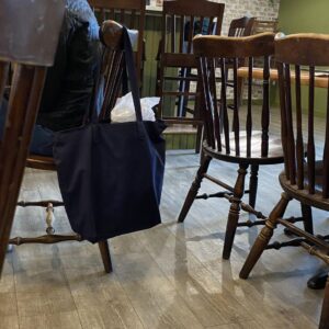
(If you were wondering about the above photo, this is a perfect example from the restaurant in question; how much room would there be if someone was sitting in the other seat? There is already not enough room to walk between chairs without bumping into the bag).
When laying out a dining room and estimating space, chairs should not pushed into the table but should be pulled out enough as if someone was sitting in each seat, plus some extra space for handbags or backpacks and coats to hang in the winter (especially if there is no coat rack, as in this case).
There is nothing worse for a customer than having to ask people not to just move their “stuff” but to actually have to get up so someone could get out to use the restrooms or to leave.
It’s even worse if you have waitstaff juggling hot food or a tray of drinks. If your dining room layout reminds you at all of a full flight in an airplane with tiny seats, cramped space, etc., you really need to rethink your layout. What you may sacrifice in a seat or two, you will make up in spades from happy waitstaff and repeat customers.
As an owner or manager of a restaurant, most improvements can be gleaned just by taking the time to observe and to ask your staff for suggestions and improvements.
A consult I did a few years ago where we asked the staff for suggestions (and this had never been done before there) resulted in many ideas that saved the owner money, and made the working environment easier to use through flow suggestions and more productive for staff because suggestions were implemented, and staff appreciated the fact that they were listened to.
These observations are not meant to be critical but rather constructive to pinpoint areas where improvement can enhance the return on investment (ROI) and the return on the total investment (ROTI). ROTI can also be Return on Time Investment, which also applies in this case.


Thank you for the kind words Cheryl.
I like it. I always have some of these same thoughts. In most cases I don’t say anything because who would care. Owners are very busy with the day to day. So actually having this assessment as a job could be beneficial for some restaurants. Kinda like the help that kitchen nightmares attempt but at a level that is helpful. A lot of missed opportunities for owners when they are short staffed and doing everything themselves. That piece was well done Heather and I love your passion, compassion, your expertise and experience.
Ps I don’t have a restaurant but have a passion for the above article and believe Heather hit it spot on