by Heather T. | Aug 26, 2025 | Books, Business, Guerrilla Marketing, Marketing, Operations, restaurants
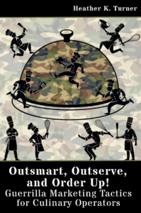 Outsmart, Outserve and Order Up!: Guerrilla Marketing Tactics for Culinary Operators was just published, and I thought I’d share a sample chapter from the book. 50% of net profits from the sale of each book will be donated to our local New Hampshire food pantries.
Brand Your Art: A Customer Creativity Contest
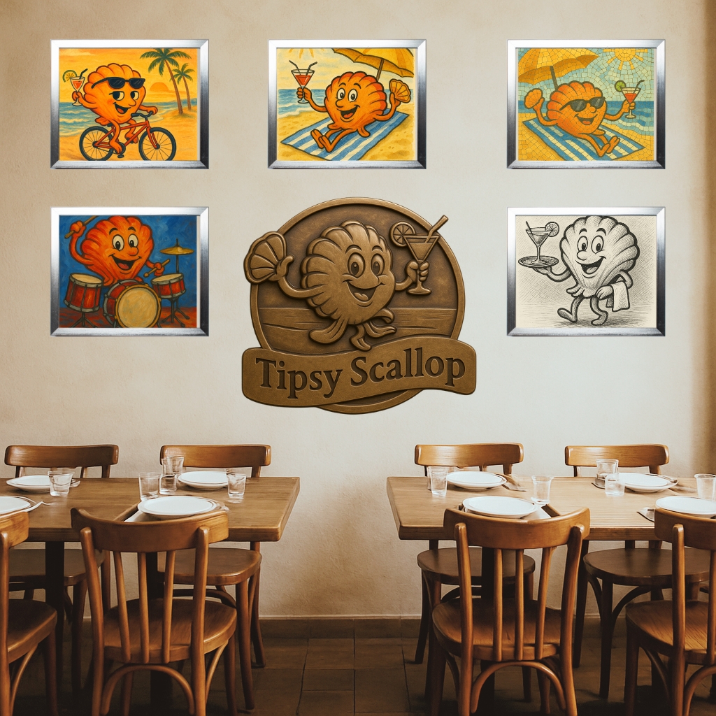
Encourage your customers to tap into their artistic side by creating a standard page-sized artwork featuring your business logo, mascot or image or character within your logo. This logo, mascot or food character can be riding a bicycle, playing a musical instrument, dancing, or engaging in any other fun, whimsical activities.

Sample Submission Guidelines: (examples)
-
Artwork must be standard page size horizontal (8.5″L x 11″ W) or size of your choosing.
-
Mediums allowed: pen, pencil, paint, collage, or mixed media. (as long as it can fit within a frame)
-
The business logo or mascot must be incorporated in the artwork in some form.
-
Bonus: if you have brand colors you use for your business, ask participants to use those colors. (And give them the digital and print color codes RGB, CMYK or Pantone.)
-
The logo, mascot or food character must be performing a fun activity. (keep it family friendly please)
-
Limit of one submission per entrant.
-
Submission deadline: [Insert Date]
You will need to have an enlarged version of the logo or mascot, (this could be regular page size) posted somewhere and encourage people to snap a picture of it so they can recreate it for artwork. Also think about how you want entries submitted, Via email? Dropped off? Other?
Voting Process: (examples)
-
Display entries in the restaurant on a designated wall and on social media. Very inexpensive frames can be obtained from the Dollar Tree or other discount stores, or online retailers, to keep costs down.
-
Customers can vote in-store by placing a ticket in a designated voting box or online via social media reactions.
-
Voting period: [Insert Date Range]
-
Top three artworks with the most votes win.
Prizes: (examples)
1st Place: $100 gift card (or other prize/incentive)
2nd Place: $50 gift card (or other prize/incentive)
3rd Place: $25 gift card (or other prize/incentive)
You could do this on a monthly or quarterly basis and just have “one” theme, ie mascot riding a bicycle, next month is mascot surfing, etc. and just keep the top three from each month up permanently and as additional ones are done, and more wall space is needed just keep the 1st place winners up long term.
Promotion:
-
Use posters, table tents, and social media posts to promote the contest.
-
Feature the winning artworks prominently in the restaurant and online.
-
Consider making limited-edition merchandise (like t-shirts or tote bags) featuring the winning designs. You need a signed agreement with the original artist.
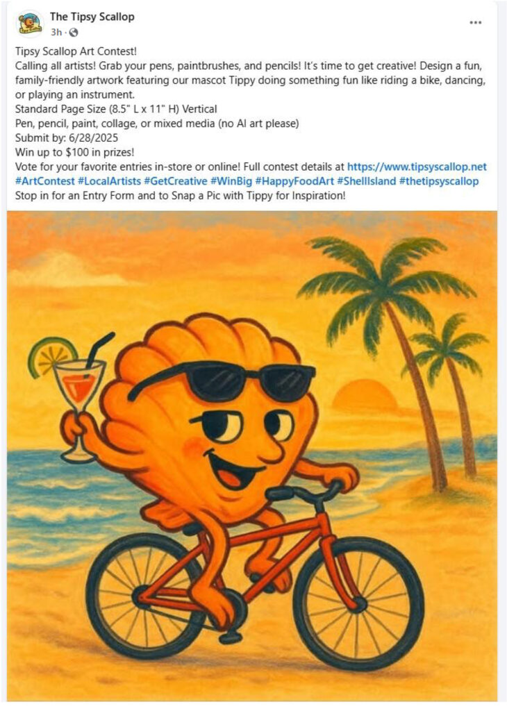
Sample Promotional Flyer: Food Adventure Art Contest
Get Creative & Win Big!
Show off your artistic talent in our Food Adventure Art Contest! We’re looking for fun, family-friendly artwork that features our “logo, mascot, or a food character” engaging in a fun activity like riding a bike, playing an instrument, or dancing!
Submission Guidelines: (sample)
-
Example: Artwork must be 8.5″ L x 11″ W horizontal (standard page size).
-
Mediums allowed: pen, pencil, paint, collage, or mixed media (as long as it can fit within a frame). (No AI art please, we can tell).
-
Our “logo, mascot, or a food character” must be incorporated in some form.
-
Keep it family-friendly, please.
-
Limit one entry per participant.
-
Submission Deadline: [Insert Date]
Voting Process: (sample)
-
Entries will be displayed on a designated wall in the restaurant and on our social media pages (if applicable).
-
Vote in-store by dropping a ticket in the voting box or online by liking your favorite artworks!
-
Voting Period: [Insert Date Range]
Prizes: (sample)
1st Place: $100 gift card (or other prize/incentive)
2nd Place: $50 gift card (or other prize/incentive)
3rd Place: $25 gift card (or other prize/incentive)
Get Involved: (sample)
-
Monthly or quarterly contests, each with a new theme (e.g., mascot surfing, mascot dancing, mascot eating).
-
Winning artworks stay up all year, with 1st place pieces displayed long-term!
-
Consider submitting every month for a chance to have your art featured on limited-edition merch!
-
Ready, Set, Draw! Submit your artwork by [Insert Date] for your chance to win and be featured!
Prep List:
-
Choose the art theme (e.g., mascot/logo biking, dancing, cooking, etc.).
-
Finalize submission deadline and voting period dates.
-
Determine allowed artwork size (e.g., 8.5” x 11”, portrait or landscape orientation).
-
Set guidelines for acceptable mediums (pen, pencil, paint, collage, etc.). Do you want to allow AI?
-
Require inclusion of logo, mascot, or food character in the artwork.
-
Decide on the submission method (in-person drop-off and/or email submission).
-
Post a large version of your logo/mascot for participants to reference or photograph.
-
Create a digital flyer with all contest details.
-
Write a short set of rules (“1 entry per person” and “family-friendly content only” etc.).
-
Purchase low-cost frames for displaying art (Dollar Tree or similar).
-
Designate a voting wall area inside the restaurant.
-
Create a labeled voting box with entry tickets.
-
Plan for social media voting (use “like” or “reaction” counts).
-
Choose and announce the number of winners (e.g., top 3 by votes).
-
Determine and budget for prizes, Examples:
-
1st Place – $100 gift card (or custom prize)
-
2nd Place – $50 gift card
-
3rd Place – $25 gift card
-
Prepare any physical prizes or certificates in advance.
-
Design and print posters for in-store display.
-
Create table tents or inserts for menus.
-
Promote via:
-
Schedule reminder posts leading up to submission deadline
-
Encourage staff to mention the contest to customers.
-
Plan for monthly or quarterly contests with changing themes.
-
Keep all 1st place winners displayed long-term.
-
Feature winners in a social media spotlight post.
-
Explore turning winning entries into limited-edition merchandise (T-shirts, totes, etc.).
-
Announce winners online and in-store.
-
Reward participants and thank them publicly.
-
Archive submissions digitally (consider a social media highlight or gallery on your website).
-
Refresh the contest theme and restart the cycle if recurring.

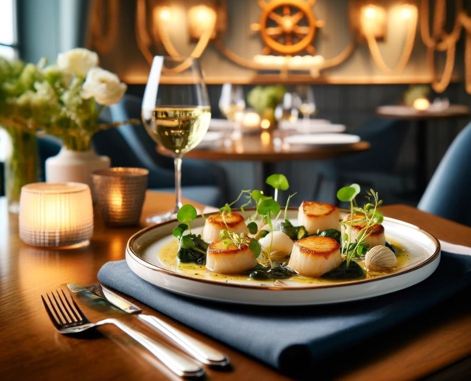
*ChatGPT was used to create the restaurant setting above and the images based on the restaurant logo. Canva was used to put everything together.

by Heather T. | Jul 31, 2025 | Blog, Business, Email Marketing, Guerrilla Marketing, Marketing
 In anticipation of getting my restaurant guerrilla marketing book finished in about a month, I was exploring additional ways to get the word out there. Business books are never an easy sell, and for the first two books I wrote last year, I literally did nothing for advertising. This was more a fault of it just being a brain dump of information that I just wanted to put down on paper, rather than a wish to be a well-known author (someday when I finally finish that fiction thriller and get beyond chapter one maybe LOL).
I belong to about a dozen Facebook groups with writers, publishers, aspiring writers and the sometimes overly intrusive vendors who frequent those groups, and Substack kept coming up. As in, if you’re an author (of any vein) you should be on Substack.
Having “heard” of it but literally knowing nothing about the platform, I set an account up and rapidly went WHOA!, this puppy offers a lot for free. I’m still digging around in the back end for all the options and bells and whistles.
From a business perspective, I’d say to businesses, at least check it out. Free newsletter option for unlimited subscribers, including tracking, email a.k.a. blog posts, plus the option to have paid email subscribers (with some gated content) and free podcasting.
Pros:
Posting a blog post is easy, about as easy as using Blogger (owned by Google) blog. I have not yet tested the podcast functions, but it’s on my list and people I have talked to that podcast on it seem to love it.
It gives you the option to add watermarks on any images, which I find useful, and lets you also add alt tags to the images (good for SEO and accessibility).
It gives you stats on open rates, viewers, referral sources, and subscribers, and the time lag for updating stats seems to be around 6 hours.
I do very much like that it gives you “who” specifically opened in email the post for any email subscribers. It also tracks clicks.
Cons:
It took some poking around to go through all the options and figure out things. I could have sped that up quite a bit if I had read the help/support section first, but I tend to like to poke around in things and see how they work because it’s more fun IMO.
SEO value seems negligible to none if you just use the platform “as is”. It gets picked up by Google if you are sharing the posts on other social platforms. I’ve only done five posts so far, and two plus the main page are indexed, so it will be interesting to track SEO value as I do more posts and also enable more exposure to it (below).
I have not yet added it to Google Search Console, set up Google Tag manager, or done a sitemap yet for it and submitted it, but in researching this definitely shows that this “helps” with getting posts and the account indexed.
It does not give you the ability to add categories, tags, or separate keywords to posts like many blogging platforms do.
The layout is pretty basic as is there really isn’t much, think basic formatting options from a MS Word document minus the ability to pick fonts and font size above basic heading size options. You can add a custom visual header to the posts/email newsletter, but customizing the actual blog post/email newsletter is very, very basic. (but it’s free, so there is that). It does allow images, embedded audio and video. I did find it interesting in playing with it a bit that if you wrote a blog post in WordPress for example and then copy the text/images straight from a website into a Substack post it does copy over the text size, formatting and font style. I have not yet tried an actual blog/email to see whether it transfers the formatting through into email, but if it does (and will test) it could be a work around to make the email newsletter/blog post a bit more customized.
If you want to explore Substack, I’d recommend checking out https://substack.com/resources and https://support.substack.com/ (at the bottom of the page: Getting Started on Substack).
Here are the four Guerrilla Marketing Tips I wrote this month for Substack:
Zoom Cameo Challenge
July 29, 2025-Tactical Tuesday: Guerrilla Marketing Tip
https://forfeng.substack.com/p/zoom-cameo-challenge
Spot the Code, Score the Deal
July 22, 2025-Tactical Tuesday: Guerrilla Marketing Tip
https://forfeng.substack.com/p/spot-the-code-score-the-deal
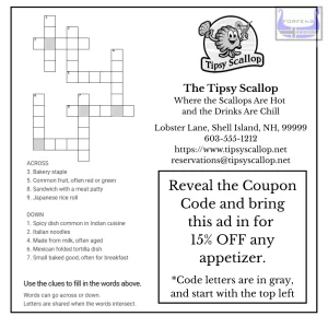
Offer a Coupon Code Hidden in a Puzzle
July 15, 2025-Tactical Tuesday: Guerrilla Marketing Tip
https://forfeng.substack.com/p/offer-a-coupon-code-hidden-in-a-puzzle
Local Landmark Photo Challenge
July 8, 2025-Tactical Tuesday: Guerrilla Marketing Tip
https://forfeng.substack.com/p/local-landmark-photo-challenge
by Heather T. | May 15, 2025 | Books, Business, Marketing, Observations, Operations, restaurants

Larger Version at the Bottom
Times are tough, that’s nothing new for the restaurant business. I hear that quite a bit from business owners. I don’t want to discount; I don’t want to give away incentives. Margins are thin….etc.
For some businesses I would agree, if it’s what I call a “one and done”. An example might be a hardware store gives away a coupon. The recipient of the coupon waits until they need something to go to the hardware store, they may buy a few things or maybe only one thing that they use the coupon on, and “maybe” have an impulse buy. The hardware store isn’t really getting “more” out of them, other than the customer went to their hardware store, instead of the competitors and they had to lose a little of their profit margin to get them in the door.
Trying to upsell in a hardware store is doable, of course, but all I can think of is a hardware store employee, “Sir, I know you are buying this cordless drill only so you can fix your deck railing, but have you considered this beautiful set of 150 drill bits and perhaps an extra battery as well?”
Restaurants and most other eateries can use discounts and incentives to leverage MORE sales.
If you offer someone a free or deeply discounted appetizer or dessert for example, statistically most diners don’t like to dine alone, there are exceptions of course, but even for single diners, most people won’t go to a place “just” for an appetizer or “just” for the dessert.
If a couple comes in and takes advantage of the free appetizer, it’s not a lot of food (for them) even if they split it, and you still have them in the door to order at least a couple of entrees, possibly another appetizer, maybe some desserts and drinks. Once you have gotten them in the door, that’s also the time to have your staff and management trained to step in and upsell for some additional revenue.
Example: Succulent Smoked Shrimp & Grilled Corn Fritters with Spicy Remoulade.
The manager who is assisting with waiting tables, “Oh, you are ordering the shrimp and corn fritters, I LOVE those, I get those with my girlfriend when we come in on my day off. She swears the Kung Fu Girl Riesling is the BEST with it. I was skeptical because I’m not really a sweeter white fan but the remoulade is a little zippy and it helps balance the spice. She orders it every time we come in and now I’m a big fan!”
Double whammy here for marketing. Yes this example is a little over the top and a little wordy if vocalized, but an example of the upsell, in that the manager says A. he loves the food (he’s a fan) and B. he loves the place so much he will come back on his day off (employee loyalty).
Currently, Kung Fu Girl Riesling runs about $12 retail and less wholesale. Even based on the retail price, if you serve one 5 oz. glass of wine at $5.00 (cheap right?) and the wine is $2.40 your cost per glass, plus tack on a percentage for labor and overhead, you are still making at least a 50% profit margin. And that’s based again on retail pricing.
Even if you upped this to a 6 oz of wine, with wholesale costs, you are still making a hefty profit on this. That’s if you sell it by the glass which is the way to really make money on wine. I worked with an extremely good waiter named Karl many years ago who would use this type of upsell to increase the check average (and his tips). Personal buy-in plus personal endorsement equals sales.
This has always been my personal pet peeve with restaurants, and it’s also a pet peeve of many diners, who refuse to pay for a bottle of wine or by the glass that’s more than double retail prices, and up to four times retail in some places.
Give generous pours at affordable prices and people will order more. Having a great (but inexpensive and unknown) house wine is another way to increase profits, years ago when I was the Chef at a resort in Vermont, I did the wine ordering too, because I liked to do pairings and our front of house manager didn’t know much about wine. The “house” cabernet which was from a small vineyard on the Western Cape of South Africa cost me wholesale $3.50 a bottle. There was no brand name recognition for the wine, so no preconceived thoughts about price, but I had a nice writeup about it on the wine menu so people could get some insight into what kind of wine it was and what it paired well with. We got four pours from the bottle at $4.50 a glass. One dollar profit on one glass ordered (and paid for itself) and 3 additional glasses pure profit minus a small percentage for labor and overhead tacked on, still a hefty money maker.
If you want to make money on full bottles, drop the price to something realistic. Believe me, you will sell a LOT more wine, having done this for years in restaurants. Higher price points mean lower margins when it boils down to it. If you sell 3 bottles a month marked up triple your costs, you will sell less wine.
One of the methods I have used prior is to add on approximately 6 dollars to the average retail price, especially on the name brand recognized affordable wines, to keep the menu price point under $20. You are still making a profit on the $6, including the wholesale discounted price and the labor is the bartender taking 1 minute to open the cork and pour, and a small percentage for general overhead.
You can also add a few dollar corkage fee if you want to bring the “illusion” of costs down even more. $12 of drinkable but inexpensive wine (retail), it’s $16 for the bottle on your menu, plus a $2 corkage fee.
If you train your staff on wine and other beverage pairings and make them able to give suggestions, it not only increases your margins but increases staff knowledge. Pairing wine and beer on the menu itself is also a proven way to increase revenue.
If you or your staff is not well up on wine knowledge, at the moment, ChatGPT can come up with a great list of wines and beers to pair with your menu. I would spot check all of those as in testing as it came up with a couple of “fictional” wines when doing a bunch of testing, but knowing quite a bit about wine and food pairings myself, I’d say it does a more than better-than-average job. Put your menu into ChatGPT or other AI of choice and some specifics, Pair with wines under X dollars and the menu item and any other parameters you want to put in, i.e. Spanish wines only.
Having pairing suggestions on your menu, both alcoholic and non-alcoholic, makes it easy for people to decide and also for those that are afraid or just don’t feel comfortable asking for recommendations.
Tying these into a discount or promotion is carrying it one step further.
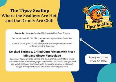
Get our fan favorite: Smoked Shrimp & Grilled Corn Fritters and get two dollars off our Iced Lemongrass-Mint Green Tea. Tea is a high profit margin item that costs less than $.50 even with some extra ingredients, selling it at $4.00, even with a dollar off is still a very good “extra” profit item. Most other beverage items, even with a discount, are still money makers.
A few examples, and giving some examples of different ways to describe the menu item as well as the beverage descriptions.
Vegetarian Small Plates + Pairings
Crispy Oven Roasted Artichoke Hearts with Zesty Lime and Rosemary Vegetarian Aioli
For one person: $7.50 For two: $14.50
Pairing Suggestions:
White: Oyster Bay Sauvignon Blanc (NZ)
Aromatic tropical fruits and bright citrus notes, with a refreshingly zesty finish. Recently awarded 90 points by James Suckling.
6 oz. Glass: $5.50 Bottle: $16.50 (Retail average is $10, wholesale would be less).
Red: Georges Duboeuf Beaujolais-Villages
Light-bodied, bright cherry and raspberry fruit, hints of violet and earth. Crisp acidity and low tannins make it food-friendly.
6 oz. Glass: $6.50 Bottle: $19.50
Beer: Bell’s Light Hearted Ale
Light Hearted is aromatic, balanced, and incredibly easy-drinking. This Lo-Cal IPA has only 110 calories, yet all the Heart. Centennial and Galaxy hops result in citrus and pine aromas, while a variety of specialty malts help give Light Hearted its body and flavor.
$4.50
Traditional Cocktails
Gin Gimlet with a Rosemary Twist
Lemon-Basil Vodka Fizz
Non-Alcoholic
House Made Cucumber-Lime Sparkling Water with a Rosemary Sprig
House Made & Herb Shrub
Iced Green Tea with Lemon
Grilled Aji Amarillo Pepper** and Sweet Basil Marinated Halloumi Skewers with Grilled Figs and a Drizzle of Honey Balsamic. **Aji Amarillo Peppers are a spicy South American chili pepper with vibrant orange-yellow skin and fruity flavor. On a scale of spicy peppers from 1-4, Amarillos are about a 3, the Halloumi cheese balances the spiciness of the peppers and brings it down a notch.
Pairing Suggestions:
White: Santo Wines Assyrtiko
Assyrtiko, a Greek white wine, is known for its high acidity and mineral notes. These characteristics complement the salty halloumi and cut through the richness, while the wine’s citrus undertones harmonize with the sweet basil and balance the Aji Amarillo’s heat.
Red: Domaine du Pélican Arbois Poulsard
A light-bodied, naturally bright red from the Jura region of France. It shows delicate red berries, subtle earthiness, and a whisper of spice. Tannins are soft, and the wine finishes with refreshing acidity and a touch of minerality. Earthy undertones match the grilled figs and basil, while the light body complements the dish’s delicate balance of sweet, smoky, and herbal notes.
Beer: Weihenstephaner Hefeweissbier
This German wheat beer offers a smooth, creamy texture with notes of banana and clove. Its subtle sweetness and effervescence provide a refreshing counterpoint to the spicy Aji Amarillo and the savory halloumi, while the beer’s body stands up to the dish’s bold flavors.
Traditional Cocktails
Whiskey Sour
Classic Mojito
Not So Traditional Cocktails
Basil Whiskey Smash
Housemade Honey Balsamic Old Fashioned (balsamic reduction in place of simple syrup with a dash of honey and orange bitter)
Non-Alcoholic
Iced Hibiscus Tea with Orange Peel
Pomegranate Spritzer
Housemade Ginger-Turmeric Tonic (unsweetened)
Smoked Shrimp & Grilled Corn Fritters with Fresh Mint and Ginger Remoulade
Succulent house smoked shrimp and fresh grilled corn fritters, with a side of our famous mint and ginger remoulade. Our fritters are light and airy yet delight your tastebuds with the earthy smokiness of locally caught shrimp and local Shell Island Farm organic corn.
Pairing Suggestions:
White: Dr. Loosen Blue Slate Riesling Kabinett
This Riesling offers bright acidity and subtle sweetness, which balance the smokiness of the shrimp and the heat from the ginger. Its citrus and mineral notes complement the corn fritters and mint in the remoulade.
Red: Cleto Chiarli Lambrusco di Sorbara
Light, fizzy, and dry with red berry flavors (think raspberry and cherry), floral notes, and mouth-cleansing acidity. The slight fizziness of this red helps balance the richness of the fritters and mild acidity complements the ginger.
Beer: Saison Dupont
Saison Dupont is a Belgian farmhouse ale known for its effervescence and peppery, citrusy flavors. These flavors cut through the richness of the fritters and enhance the herbal notes of the mint-ginger remoulade.
Traditional Cocktails
Moscow Mule
Daiquiri (Traditional, not frozen)
Not So Traditional Cocktails
Ginger-Lemongrass Rickey
Charred Corn Old Fashioned
Non-Alcoholic
Iced Lemongrass-Mint Green Tea
Shrub Spritz (Ginger-Mint Shrub + Sparkling Wine or Soda)
Savory Tomato-Ginger Tonic
Crispy Polenta with Roasted Beet Bites with Smoked Tomato and Lavender Jam
Pairing Suggestions:
Red: Gnarly Head Pinot Noir
This California Pinot Noir is bold for the varietal, with ripe cherry and raspberry flavors at the forefront. Underneath is a thread of vanilla and toasted oak. Medium-bodied with a silky texture and soft tannins, it finishes with a touch of sweet spice. The wine’s ripe red fruit plays well with the smoked tomato-lavender jam, echoing the jam’s sweetness and contrasting the smoke with bright acidity.
White: Geyser Peak Sauvignon Blanc
A vibrant, zesty white with high-toned aromatics: lime, gooseberry, and freshly cut grass. It’s lean and dry with a bright acidity and a mineral edge, finishing with crisp green apple and citrus zest notes. The wine’s lime and green apple notes offer a clean, tart contrast to the sweetness of the roasted beets and the smoky tomato-lavender jam,
Goose Island Sofie (Saison/Farmhouse Ale)
A Belgian-style saison aged in wine barrels with orange peel. It pours golden with a creamy head. Aromas include white pepper, orange zest, and a hint of vanilla. The taste is tart, citrusy, and subtly spicy, with a champagne-like effervescence and a dry finish. Sofie’s flavors of orange peel and white pepper brighten the earthy sweetness of the roasted beets and contrast nicely with the smoked tomato jam.
Traditional Cocktails
Negroni
Americano
Not So Traditional Cocktails
Lavender-Basil Gimlet
Smoked Tomato Bloody Mary (w/ Lavender Salt Rim)
Non-Alcoholic
Lavender-Lime Soda
Chilled Spiced Carrot Juice
Sparkling Apple-Celery Tonic
A marketing piece like this can be used for mailers, in house promotions (put it on a tent card or menu holder) encourages guests to buy prior to ordering while dining, and as social media posts. “Mention this ad and get…..”

This is a sample chapter for my upcoming book on Guerrilla Marketing, releasing mid-summer 2025. The book will be focusing on over 100 Guerrilla Marketing ideas with examples, as well as a few chapters like the above. I have a favor to ask, if you catch a typo please send me a wave and let me know, snarky comments are appreciated if they are well meant and funny, even running text through two very good grammar editors doesn’t always catch things and my book editor has not yet had a crack at this. 🙂
by Heather T. | Apr 28, 2025 | Business, Marketing, Observations, Operations, Social Media
A common complaint I get from clients, both personal, and business mentoring clients, is that they rarely have enough time to take lots of photos for marketing use. Here is an easy solution if you are running into that problem.
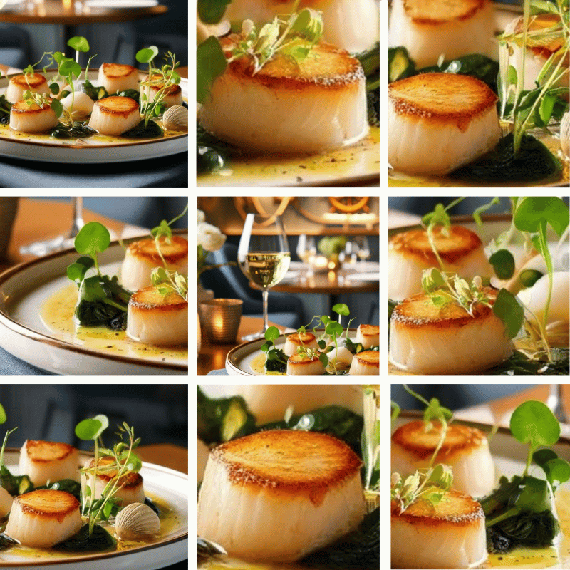
You can break most photos into at least three or four separate photos, and often many more, depending on the number of elements and objects. With the excellent photo capability of many of today’s cell phone cameras, clear auto-focused high resolution photos are very easy to get.
This is a simple thing you can do using your cell phone (or other source) photos and Canva.com. If you don’t have a Canva account yet, just start with the free version and many times for both personal and business use, that may be all you end up needing.
Step One is to create a base size for your image. It could be inches or pixels. It can be square, rectangular, vertical or horizontal. Use the image size and image format to best suit whatever project, whether it be digital marketing or print that you might need it for.
Step Two is to upload your photo (or other image, could be a graphic) to Canva.
Step Three is to insert your photo into your created image size.
Step Four is resize, zoom in, zoom out, move around the screen or flip.
Step Five is to see how many additional images you can create with one photo or graphic.
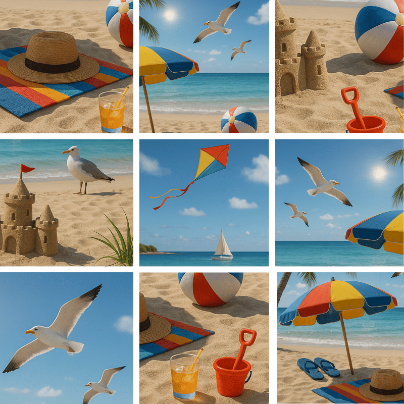
Here are a couple of examples of using one image and creating multiple images from one. I’m a big believer in keeping it easy peasy and this helps save time and extend any images you might have for marketing while keeping costs down. And these are AI generated purely to use for examples.


by Heather T. | Jan 1, 2025 | Bed and Breakfasts, Business, Food, Lodging, Marketing, Observations, Operations, restaurants
With the new year and possibly some additional challenges to the hospitality industry coming ahead, restaurants and lodging may want to think about some additional alterative ways to generate income.
I look at it this way: Plan for the Best but be Prepared for the Worst. If you are a Monty Python fan, you might recognize “No one plans for the Spanish Inquisition”. If you are not, do a little search on YouTube for the full sketch.
Many businesses don’t expect hurricanes, tornadoes, floods, earthquakes or other disasters both natural and man-made, no one could have predicted the impact Covid had, no matter what side of the fence you sit on, it had a significant impact on the economy.
Something along those lines or other (aliens could take over the world, we really don’t know what’s out there in the universe, or there could be a solar flare, sadly even more realistic) could happen but the reality is, businesses should prepare, just in case. Again, Plan for the Best but be Prepared for the Worst (as a backup plan).
I advise businesses it doesn’t matter how well your business is doing. Never stop marketing and always be prepared. When you have a power outage for a couple of days, better to have a couple of gallons of water on hand than not. Think of this as having some extra water kicking around (just as a backup) and extra money in your pocket is never a bad thing to have.
For Lodging:
Staycations have been “in” for a while, but how many lodging establishments have actually created packages for them or created a marketing plan for them?
For Rooms: (If you have 6 rooms or more (or even less) but bookings are low:
- If you have extra rooms not regularly booked, consider offering them for monthly, quarterly, or longer-term rentals. Dedicated income is never a bad thing. Medical professionals, visiting doctors and nurses are having an ongoing time finding housing and they are great short term and longer term tenants.
- Office space or Co-working space. Massage therapists always seem to be looking for space rental (also something you can use in your advertising: massage therapist on site). I saw two “asks” in local Facebook forums just in the last couple of days.
- Inventory storage space for another local business and/or climate controlled storage space for rent.
- Studio space for artists (you could tie packages into an artist in residence).
- Counselors or therapist’s rental space.
- Nonprofit office space.
For Your Dining Room/Living Room/Other Space
- Rent out space as needed to photographers/videographers who may need space for photo/video shoots.
- Offer the space for local meetings or events. If the layout and setup is conducive to having a screen and projector setup available for meetings, consider buying a projector and screen. For under $300 you can purchase both for the needs of a smaller room, and if you rent them out to meetings even for $50 or less, you can quickly make your money back. Renting out a projector from a party planning business typically costs twice that. I’d recommend if you go this route and start doing a lot of meetings adding a backup projector to the mix. You can get refurbished older projectors affordably from Ebay and Amazon. Upsell it by offering coffee, tea and other refreshments or box lunches.
- Pop up shops for local crafters or indoor farmers’ market
- Consider the old style boarding house model, room and board for monthly or longer-term renters. Finding housing is at an all time need around the country and there are probably professionals who don’t have the time or desire to cook meals for themselves, plus in need of housing. Check your local zoning laws and state laws, but if your property is already a commercial business, this may just be getting another license for an additional type of food permit. In New Hampshire, a Bed and Breakfast license is $175 per year, a restaurant license for 25-99 seats is $350 a year. You may need some additional inspections or requirements but it might be worth looking into. If you have six rooms and rent two long-term or monthly at $50 a night, that generates about $1500 a month per room, or $36,000 a year for two. Is it worth it to you to cook an extra couple of meals per day and do some extra cleaning? Even with food and some extra time for laundry, something to chew on. Just like renting to a longer term renter, you would want to be selective of who you take in, but probably less trouble than some short-term rental guests who come from an online platform.
- During the day when the space is not being used, rent it out for yoga or mediation classes (again this could be a good advertising addon for your own business)
For Both Lodging and Restaurants:
- Rent out the kitchen for commissary kitchen space (when you are not using it). There are a lot of small food producers who are looking for commercial kitchen space to use. Connect with your local SCORE chapter, SBDC, or CWE offices and let them know, so they can let clients know you have space available. In New Hampshire for example, there are less than 5 commissary kitchen spaces for use by food producers, food trucks, small chef and catering companies and other food base companies like people who make dog biscuits, but have too much volume for a home kitchen. Cottage food laws may allow a dog biscuit business to bake at home in New Hampshire, but a personal chef making meal kits must use a commercially inspected commissary kitchen or other state inspected facility. In every state, there seems to be a lot less commissary kitchen space available than what the needs of small food businesses are looking for. I run into this frequently when working with food trucks and other small food independent food providers.
- Consider co-op buying with other local food type businesses. Many decades ago, when I was a chef on Cape Cod, we did this with some other local restaurants during the slow time of year. On Cape Cod in the busy seasons, we would do several hundred covers (dinners) per night on a weekend night, during the winter sometimes we would be lucky to do a dozen covers. The choice between shopping at a grocery store to keep the restaurant going was not an option because prices are higher than wholesale, so we banded together so we could make a broadliner’s (for those new or starting in the industry, a broadliner is a larger wholesale foodservice vendor) minimum order requirements which could be $400 per minimum order. B&Bs, hotels, bakeries, restaurants, cafes and caterers, as well as smaller food service businesses (like those mentioned above) could all take advantage of co-op buying to buy in bulk and keep costs down.
For restaurants:
For restaurants I wish I had a magic wand above and beyond renting out kitchen space for additional income to deal with high food costs and the ongoing employee shortage, but here are some ideas that you could try to bring in some extra revenue and try some things that are a little different to incentivize customers to patronize your establishment.
- This differs from just renting out kitchen space, more along the lines of renting out the full restaurant during any days you are not normally open. Consider the Restaurant-as-a-Service (RaaS) for other small businesses. Rent out your full facility out to chefs or starting entrepreneurs (suggested they have business insurance and ServSafe at a minimum) to test out limited time menus or food concepts. There is no lack of people who want to start a food truck and want to test out their menus in advance, or private chefs who may want to advertise their services more. You could use this as an additional marketing tool to create buzz for your business, and tie into additional cross promotions with any small business you might partner with.
- Offer Tasting Tuesdays (or any day of the week). Beer or Wine Tastings (on your closed days) with snacks or small plate meals. Coordinate with your beverage reps to help with promotions and products.
- Beer and wine flights have been a “thing” for awhile, but what about tea or coffee flights paired with desserts or other complimentary foods, like a tea flight paired with tea smoked fish and tea smoked vegetables and/or cheeses.
- Partner with food banks or pantries to donate excess or close to code food, reinforcing your community involvement. Helping your local community and being realistic here, it’s a good advertising hook, and if donating to a 501c3, a potential tax write off. You have 2 days left on 4 gallons of milk and business is slow and you will never use it all up in time…..
- Host cultural learning dining nights, a theme might be the food of India and have some education around the menu and the ingredients, history of the dishes, and more. A server can give an overview when guests are seated, and you can provide printed handouts or QR codes on menus or tabletop stands linking to more information about each dish, its ingredients, and preparation.
A few additional things I’ve seen getting traction in bigger urban areas and a few additional ideas as well.
Incentives for bring your own takeout containers to reduce your takeout container costs (plus it’s more eco friendly and good advertising hook.
Organize some interactive dining experiences, Dining in the Dark, for instance. Many years ago, my husband and I attended a benefit dinner where you ate a 4-course meal while blindfolded. The dinner benefited a New England Guide Dog organization; the organization covered all staff and food costs, and the restaurant kept income from drinks ordered before, during, and after the dinner. Prior to the dinner there was a cash bar and light hors d’oeuvres. The event was packed with a waiting list and I have to be honest, as an attendee, it was one of the most fun dinners I’ve ever had.
A few more:
Murder Mystery Dinners, Interactive Dessert Stations (if you have never seen anyone make ice cream with liquid nitrogen, it’s a blast to watch), escape room dining (diners have to solve puzzles to get access to drinks or courses), team building dinners, roll your own California/Nori rolls (with a demonstration and people to assist if needed). Themed dinners like time travel night (food from another era) or international cuisine night. Go whole hog and do a Star Trek themed night with foods that mimic foods found in Star Trek episodes (Gagh for example is made of serpent worms (in the show), it wouldn’t be hard to make pasta with a soy-based sauce that mimics the look (but not flavor 😊) of this traditional Klingon delicacy.) If you do a little search in Google or ChatGPT for food and drinks inspired by tv shows and movies, you came up with some fun ideas you could build whole themed nights around things like Pan Galactic Gargle Blaster (Hitchhiker’s Guide) – Gin, lemonade, and a touch of absinthe or licorice liqueur, Twin Peaks Cherry Pie – A classic diner-style cherry pie with a flaky crust and Red Rum Cake (The Shining) – A rich red velvet cake with dark chocolate icing and many more.
In the coming months, I’ll try to suggest some additional revenue streams and ideas for restaurants to experiment with as well.
Happy New Year!
A Toast to the Hospitality World filled with dedicated, hardworking people who love food and the industry. May the coming year be filled with happy customers and guests, good reviews, and fresh opportunities to make a profit.
 Outsmart, Outserve and Order Up!: Guerrilla Marketing Tactics for Culinary Operators was just published, and I thought I’d share a sample chapter from the book. 50% of net profits from the sale of each book will be donated to our local New Hampshire food pantries.